This self-initiated exploration examines typography through wear, time, and context. Inspired by David Carson’s unapologetic disruption of conventional design and the cultural moment that once declared print obsolete, the study investigates how letterforms evolve outside controlled brand systems.
During a visit to a private airport, I documented found typography across aircraft, tires, cargo vehicles, pavement, and industrial machinery, treating the environment itself as a living type specimen. Shot at Coolidge Municipal Airport in Arizona, the series captures how weather, friction, and daily use naturally distort and erode letterforms, revealing texture, hierarchy, and unintended composition.
Rust, cracks, patina, and surface abrasion become collaborators in the work. Minimal vintage treatments situate the compositions within a late-’80s grunge sensibility, where typography is imperfect, expressive, and distinctly human.
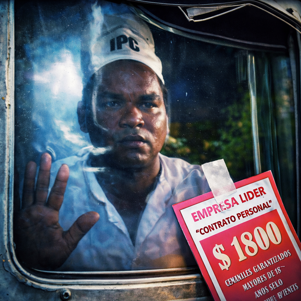
I am Mexican — a chilanga to be precise.
I grew up in Mexico City, one of the most visually saturated cities in the world. Layered typography, hand-painted signs, political posters, devotional imagery. A place that art directs itself.
Living inside that intensity, I stopped seeing it.
After time abroad, I returned and experienced the city as a living brand system. The fluorescent greens of street stalls. The imperfect kerning of hand-lettered signs. What once felt chaotic revealed itself as coded culture.
This is not political commentary. It is art direction.
Visual language is mood, rhythm, texture, and identity expressed in public space without permission.
Mexico City isn’t polluted. It’s expressive.
This work is a reset — a return to seeing with intention.
Art direction doesn’t begin in a studio.
It begins in the street.
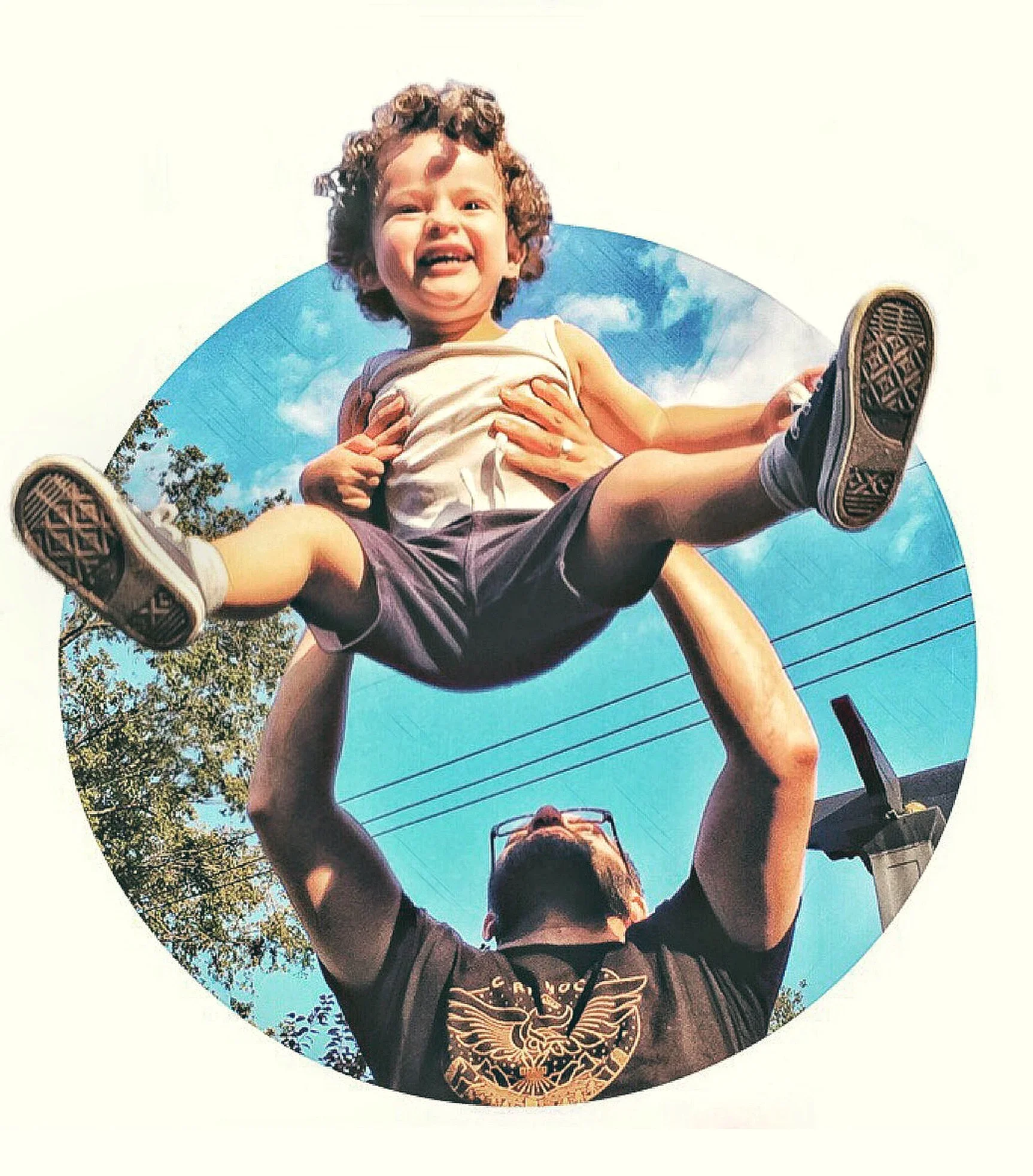
I am a visual storyteller drawn to perspective, pattern, and moments that reveal something human. I curate fragments of everyday life through a considered lens, finding inspiration in contrast, color, and the unexpected.
This collection of pictures I shot is organized as a chromatic gradient, allowing emotion and rhythm to guide the experience. Together, these images offer a glimpse into how I see the world —vibrant, joyful, and always as an opportunity of connection.