Samantha Jiménez
CREATIVE DIRECTOR
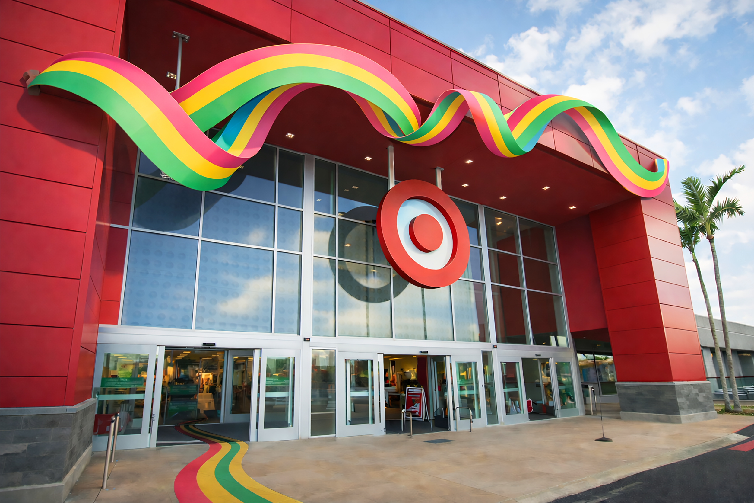
Colorful lines and ribbons sweep through the store like an open invitation, drawing guests forward and gently guiding them into moments of surprise, connection, and delight. Rooted in the patterns and textures already woven throughout the assortment, these flowing forms create a sense of rhythm and movement, turning everyday shopping into a joyful journey of discovery. As the lines intersect and converge, they shape a shared experience, one where paths cross, energy builds, and spring unfolds as a celebration of togetherness.
Mood Board
The mood is graphic, modern, and playfully optimistic, where bold stripes, color, and pattern create an energizing sense of movement and discovery. It feels welcoming and connective, inviting people to wander, gather, and feel part of something larger through joyful design and shared experience.
Optimistic. Playful. Graphic. Modern. Inviting.
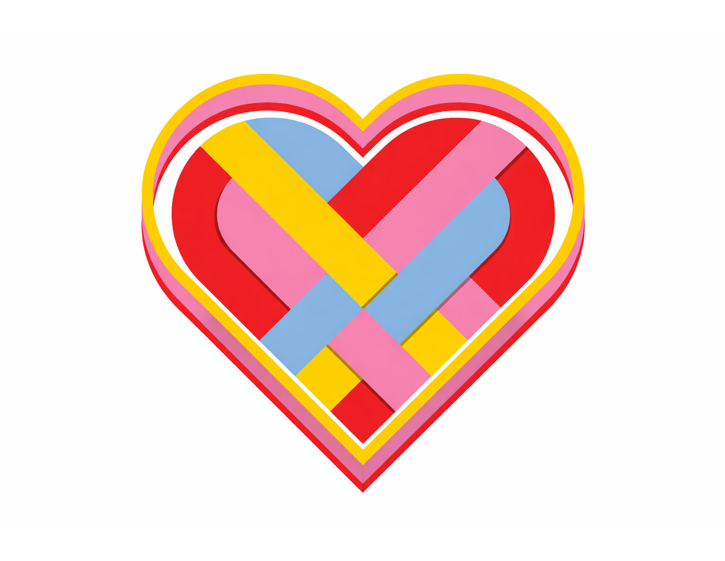
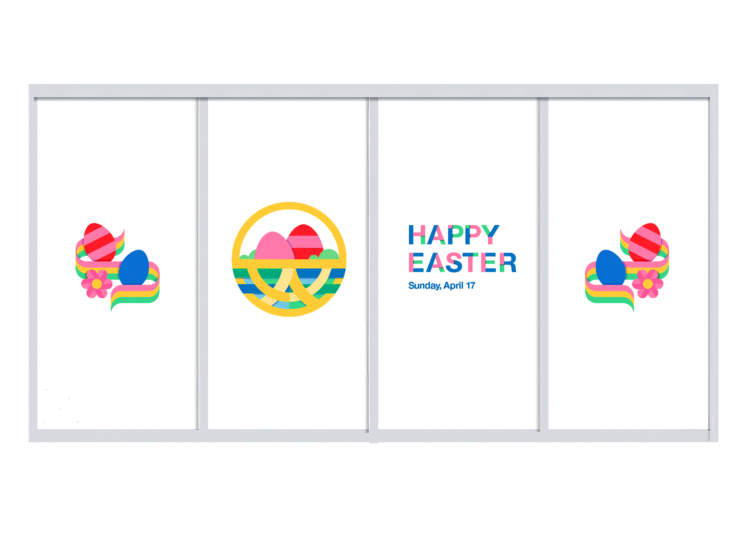
Custom Type design
This custom display type brings that sense of springtime joy to life, using layered color and flowing geometry to echo the ribbons and pathways that guide guests through discovery in store. Built from the same patterns and rhythms woven throughout the assortment, the letterforms feel energetic and inviting, turning wayfinding and messaging into moments of surprise, connection, and shared delight.
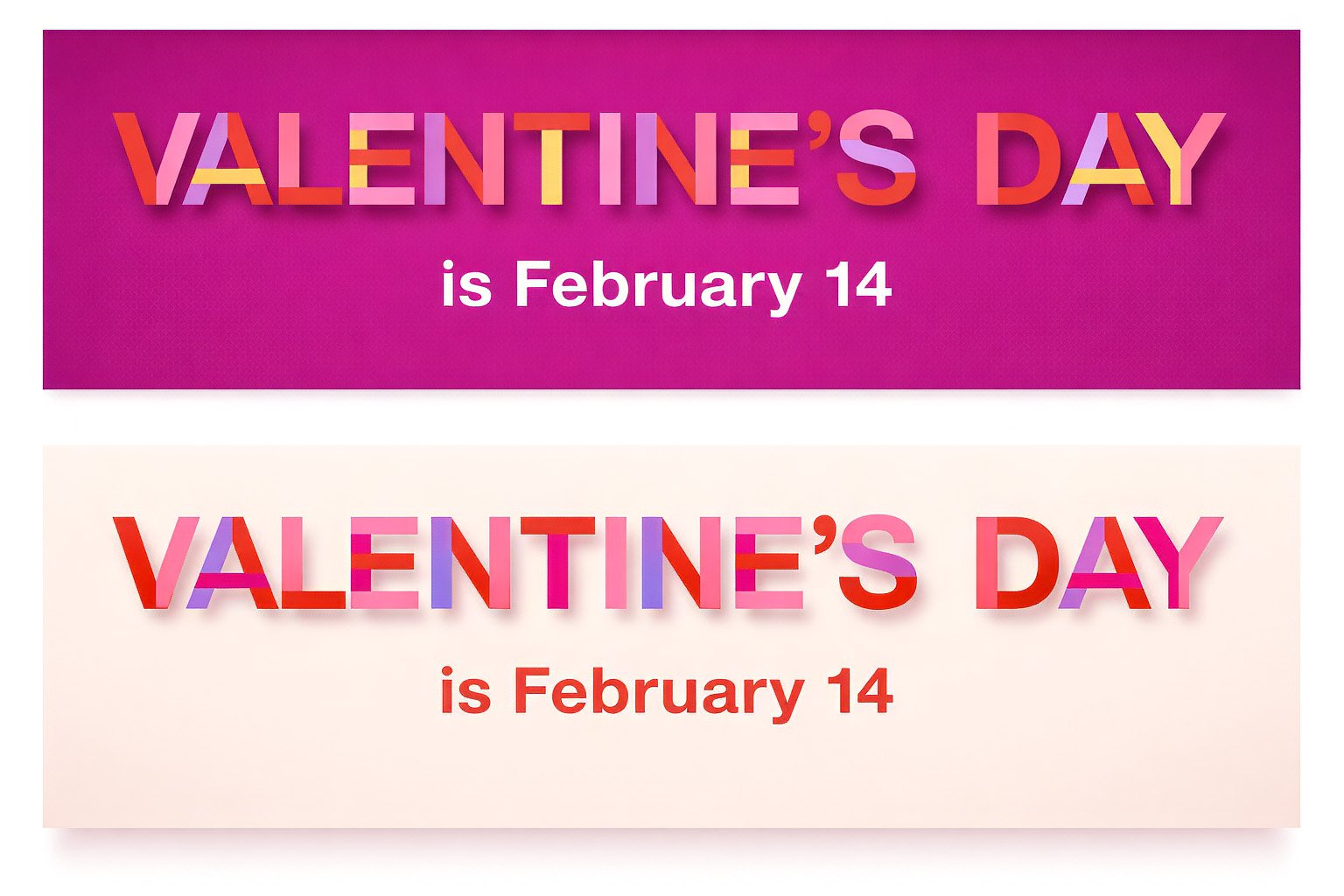
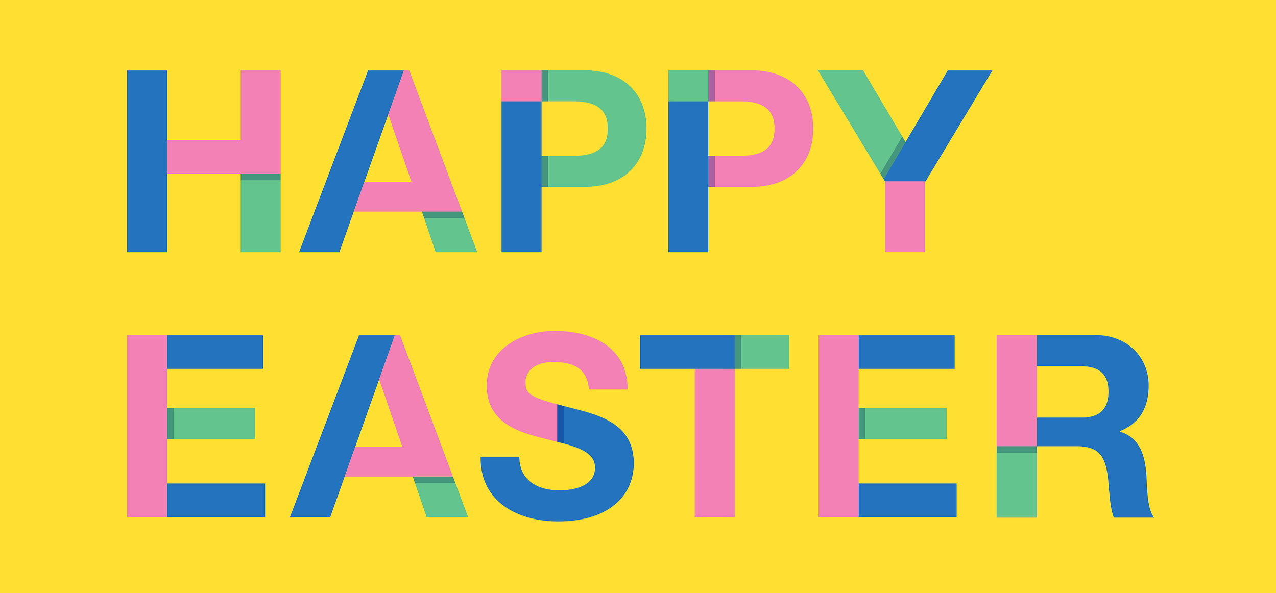
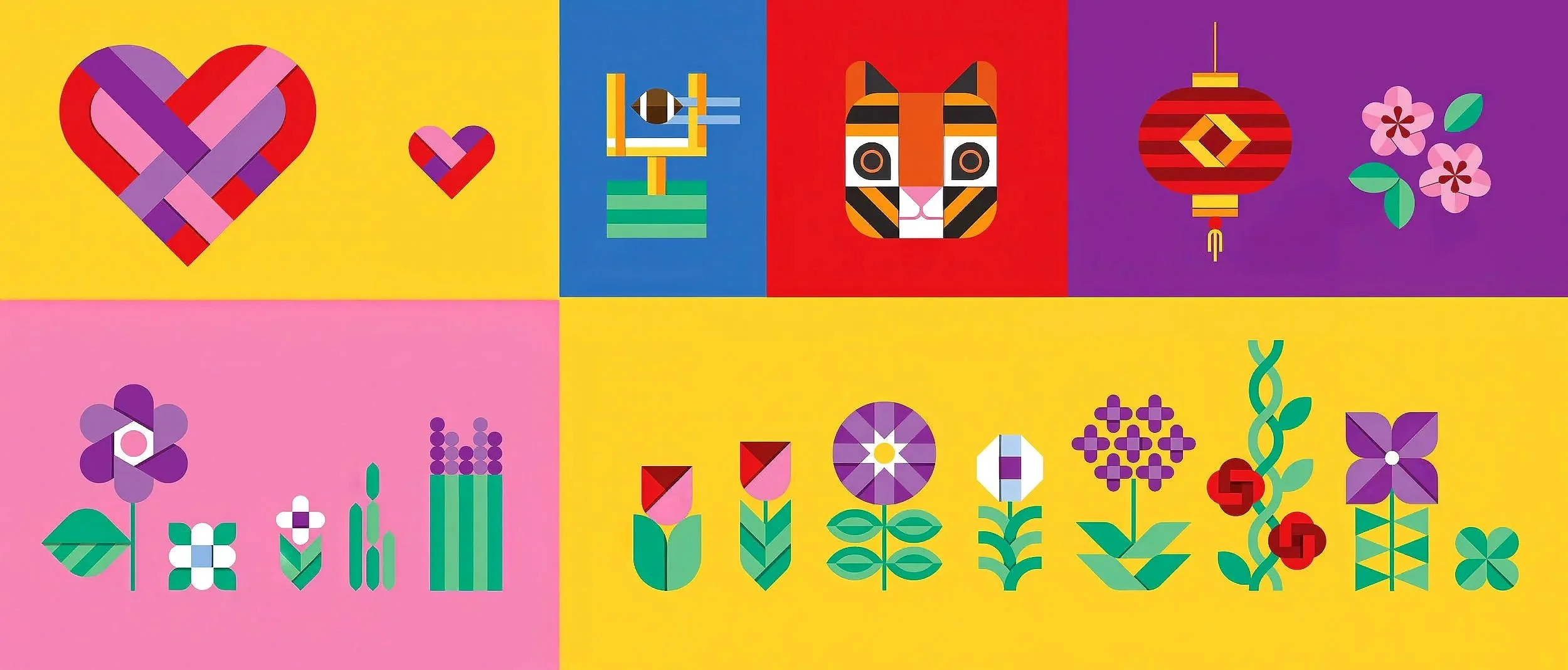
Photo Style
Playful. Chromatic. Vibrant. Expressive. Color blocked.
The photography uses strong lines and intentional framing to create a sense of motion, guiding the eye through each scene and turning everyday moments into visual stories. Color, pattern, and gesture work together to suggest energy and connection, making each image feel active, dimensional, and part of a larger, unfolding experience.
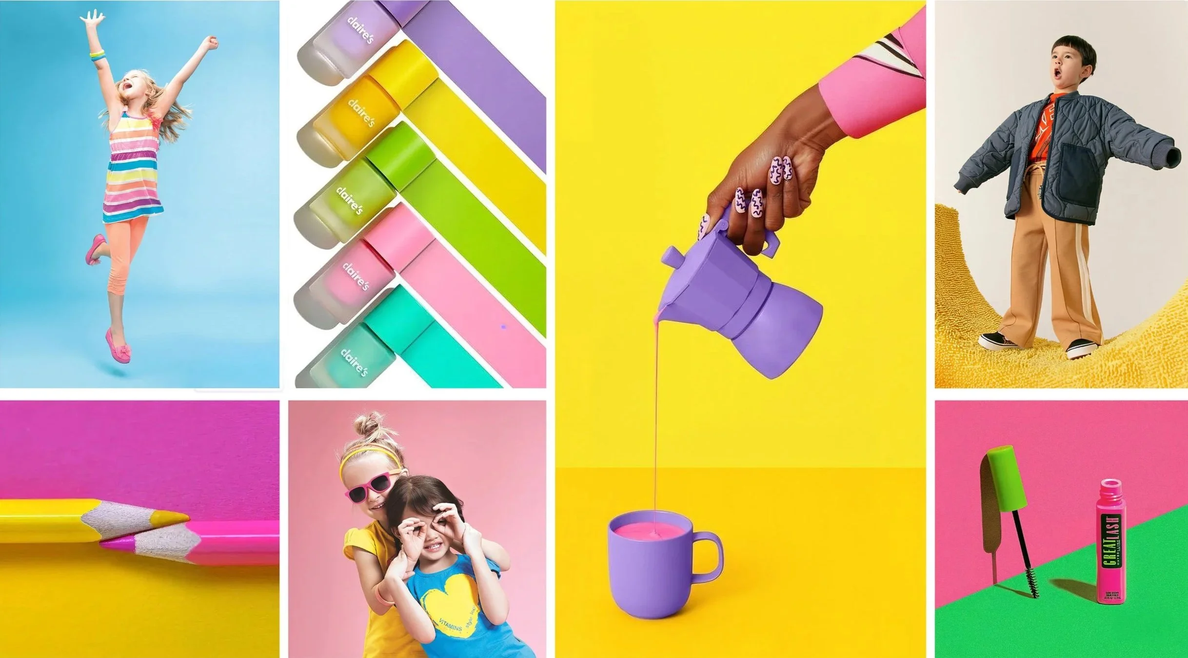
In-store Photography
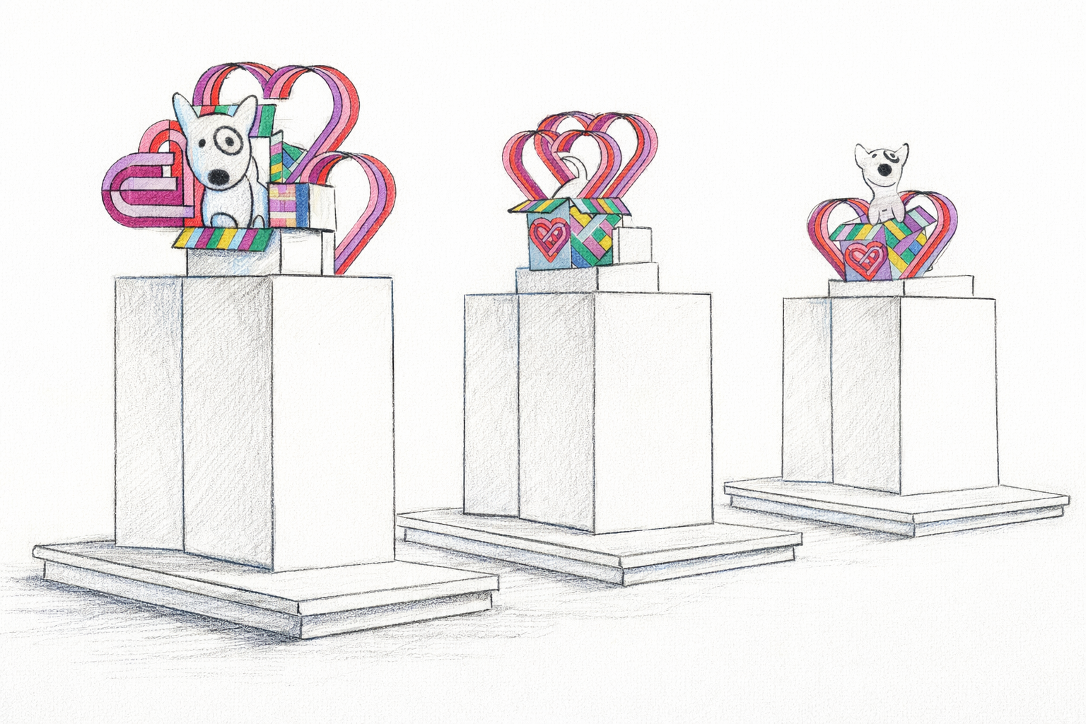
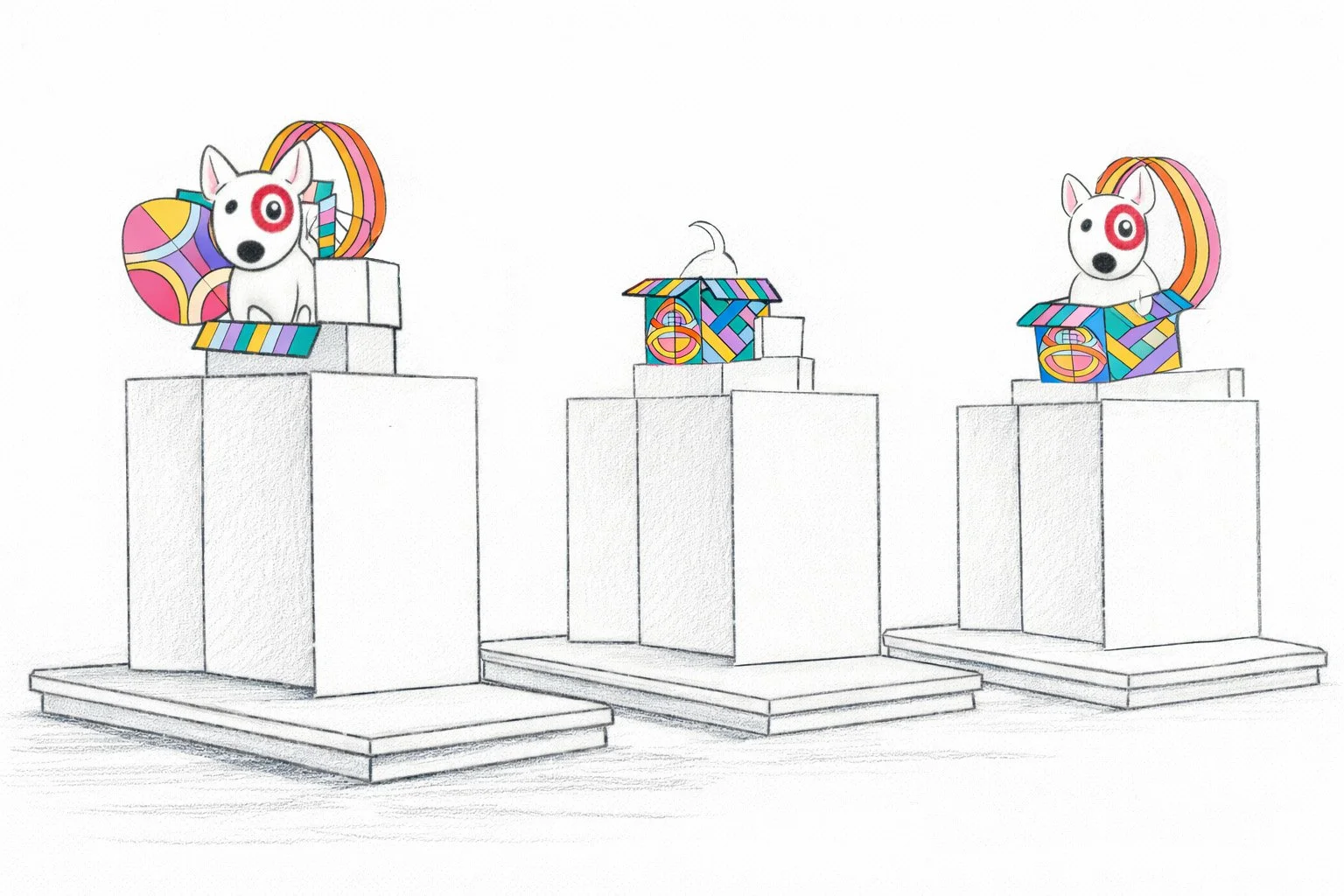
High-level sketches
These early pencil sketches offer a glimpse into the raw ideation phase, where form, scale, and storytelling are explored before polish and production. They capture the instinctive, fast-moving thinking that shapes the creative direction long before final execution.
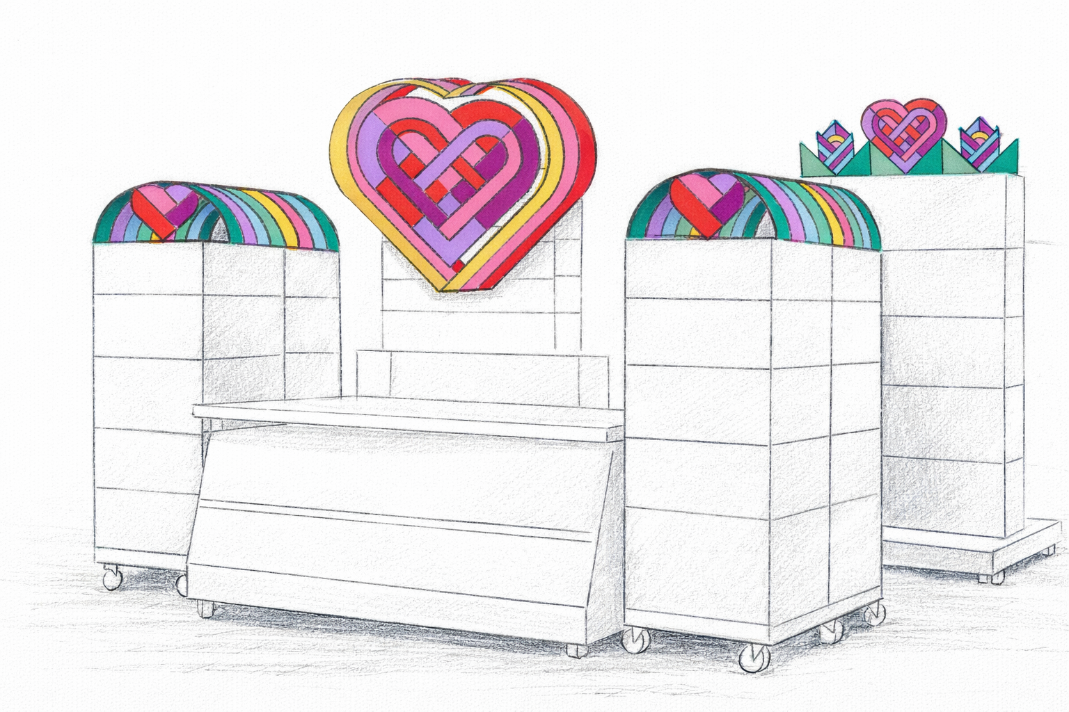
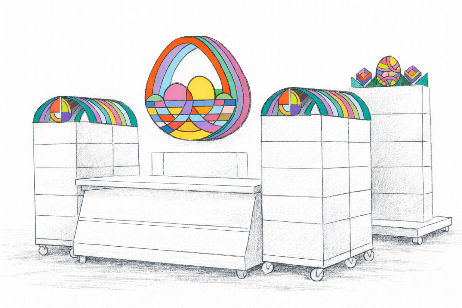
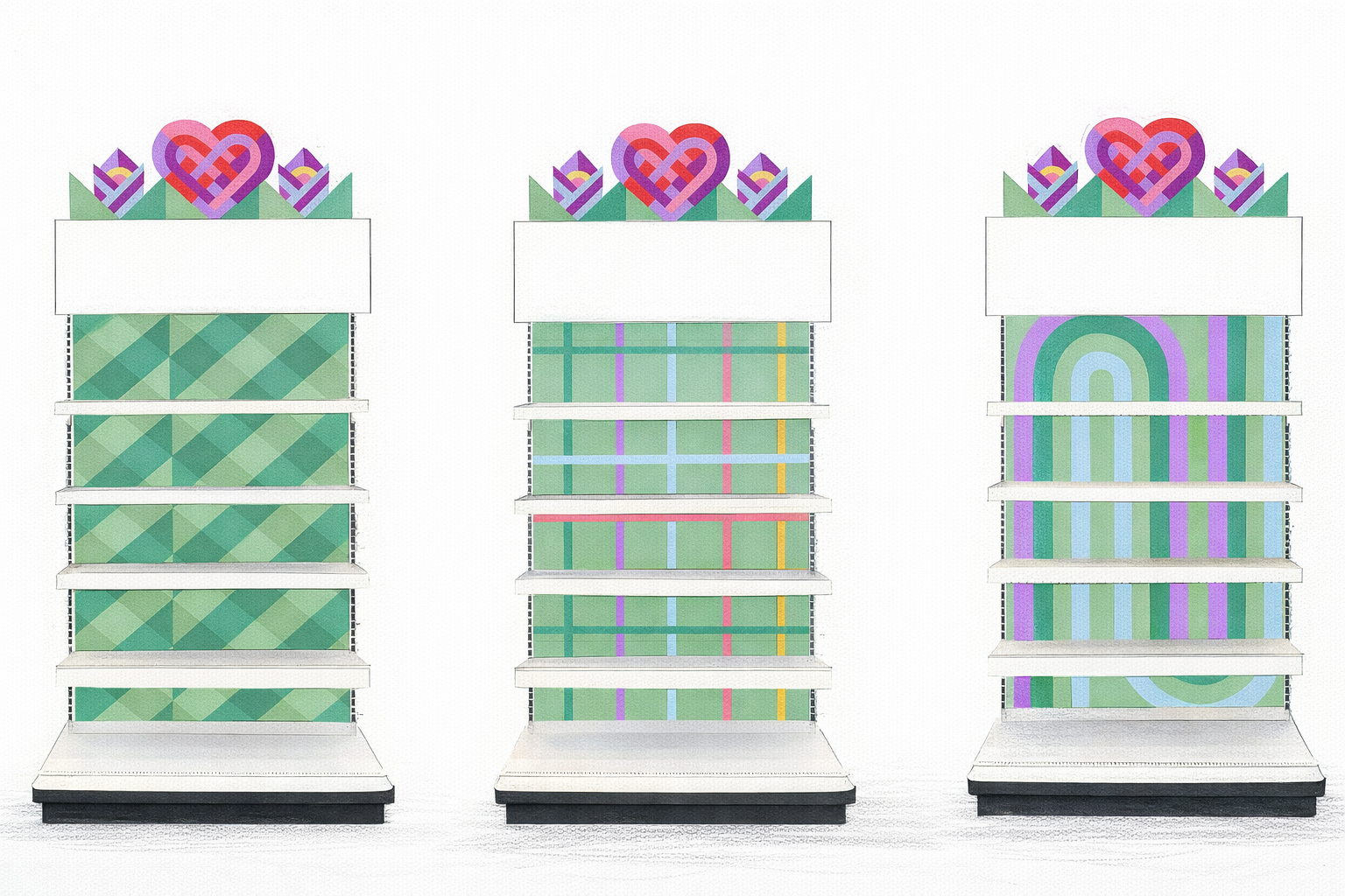
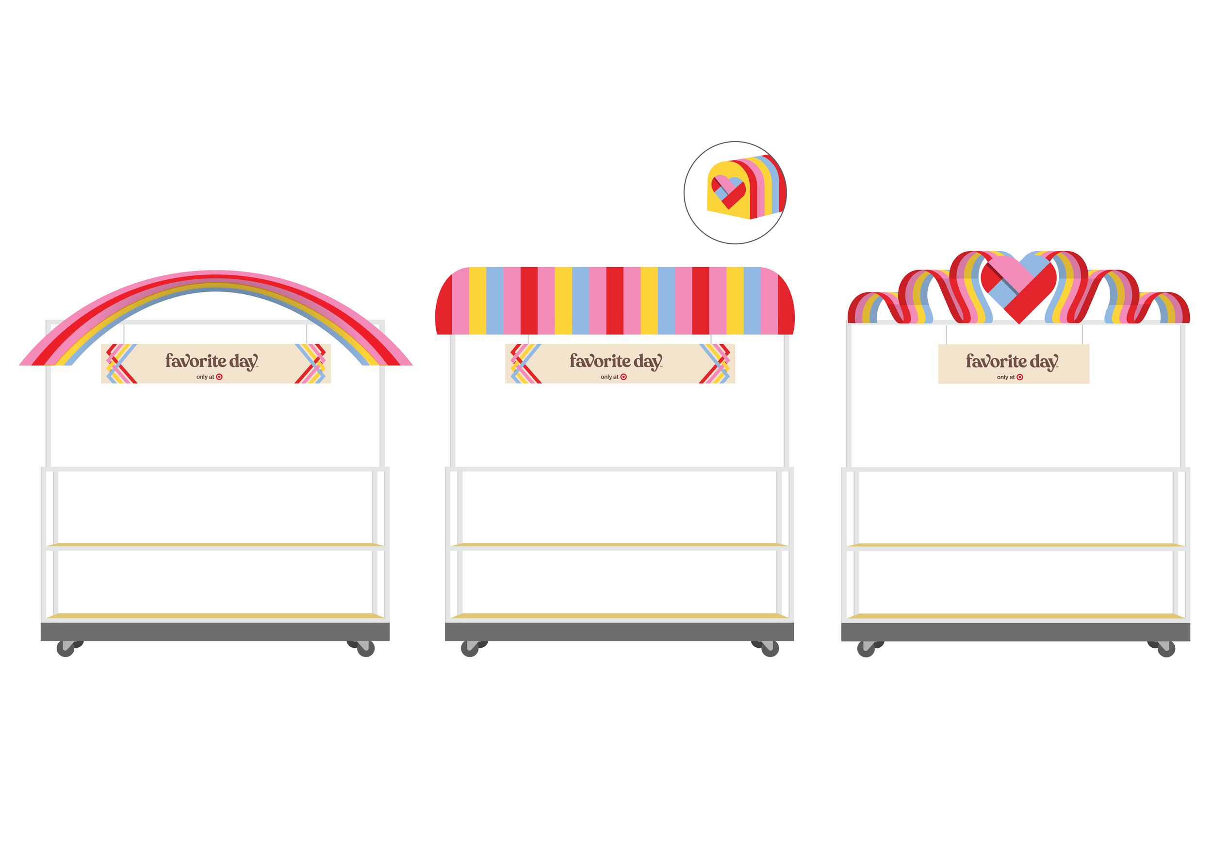
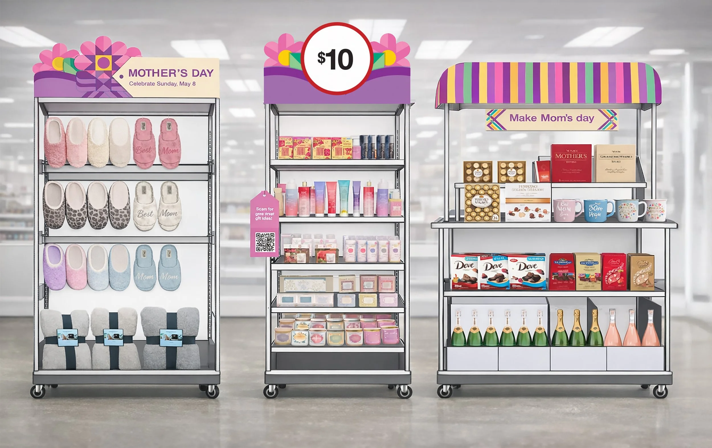
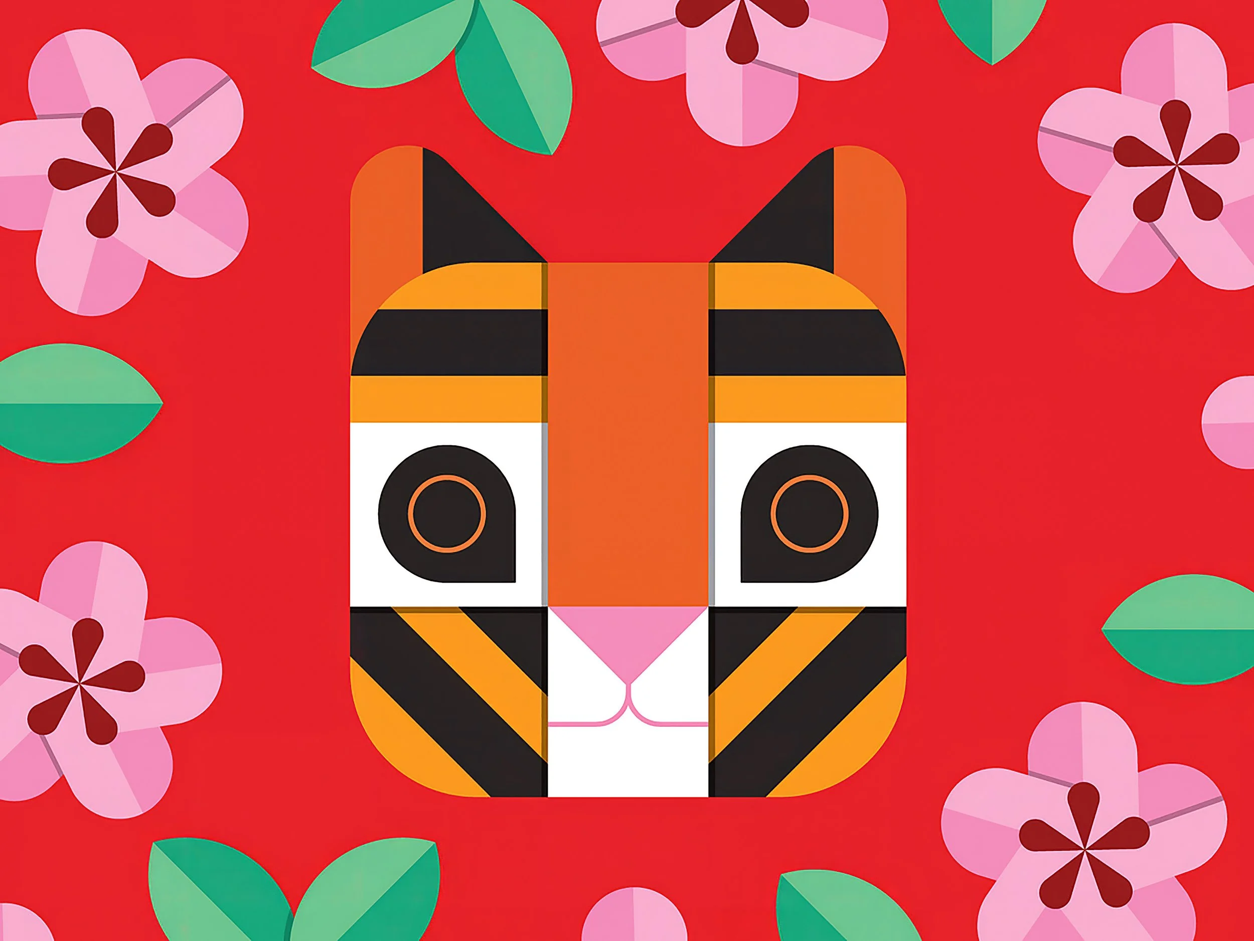
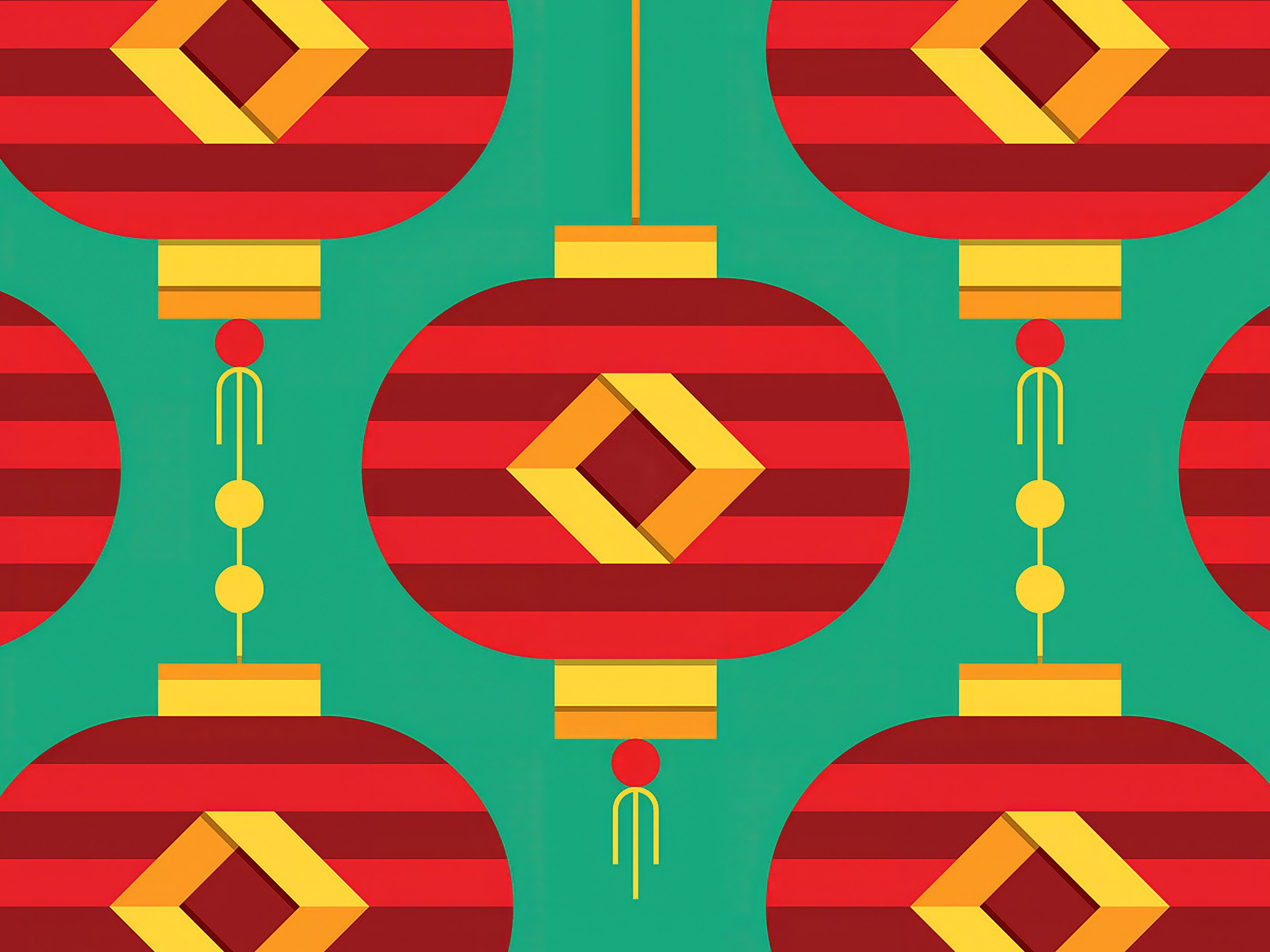
Detailed experience RENDERS
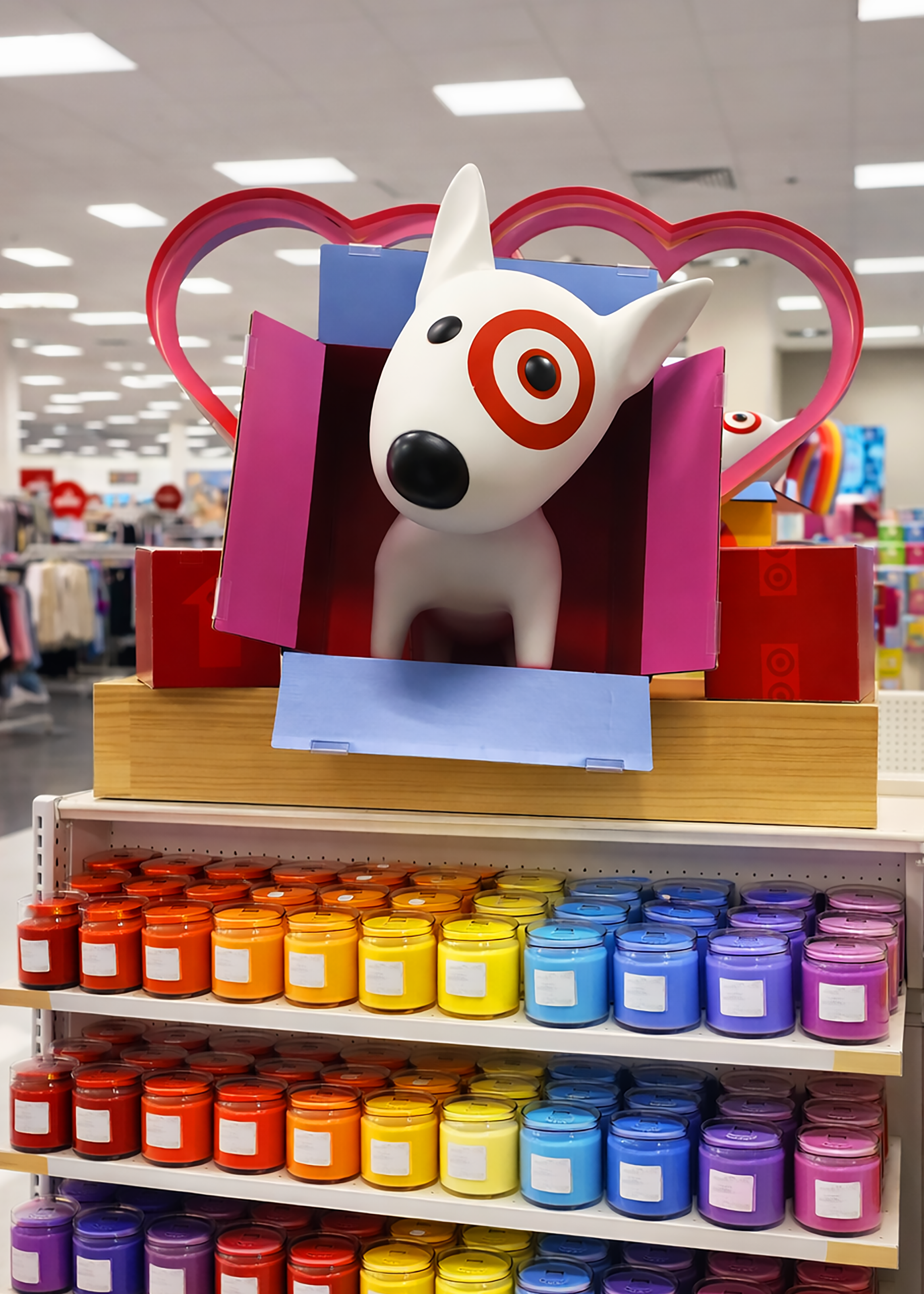
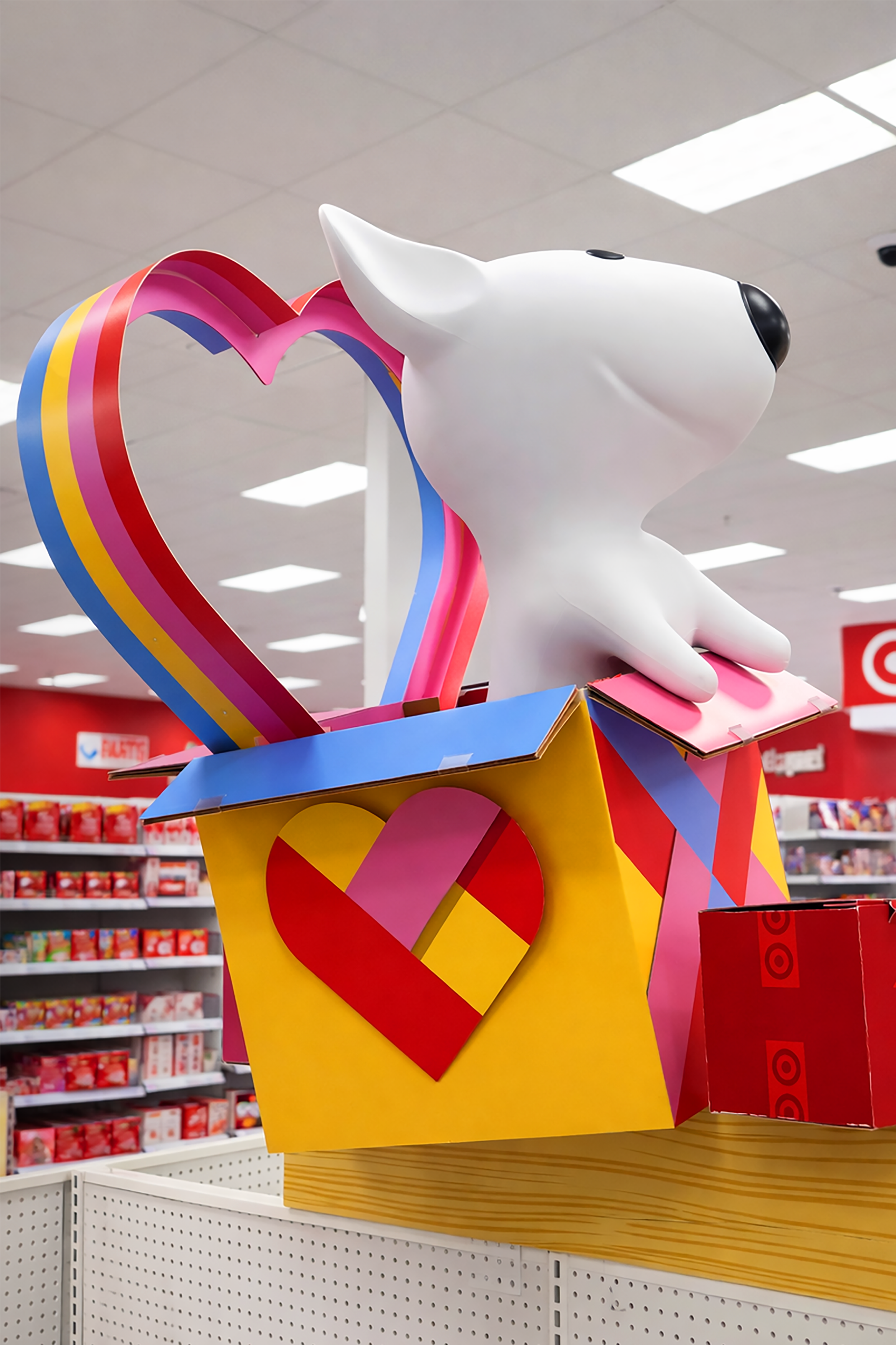
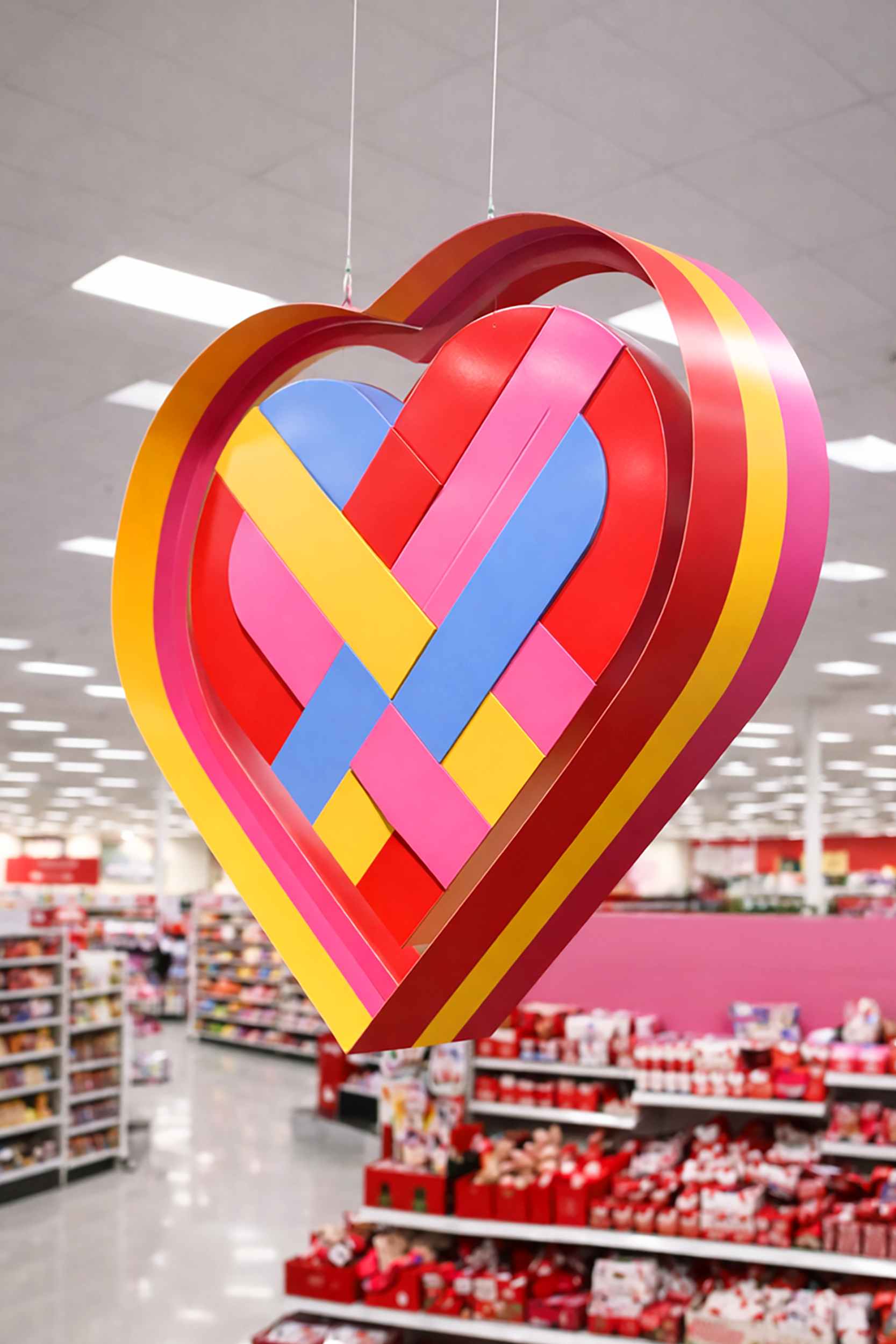
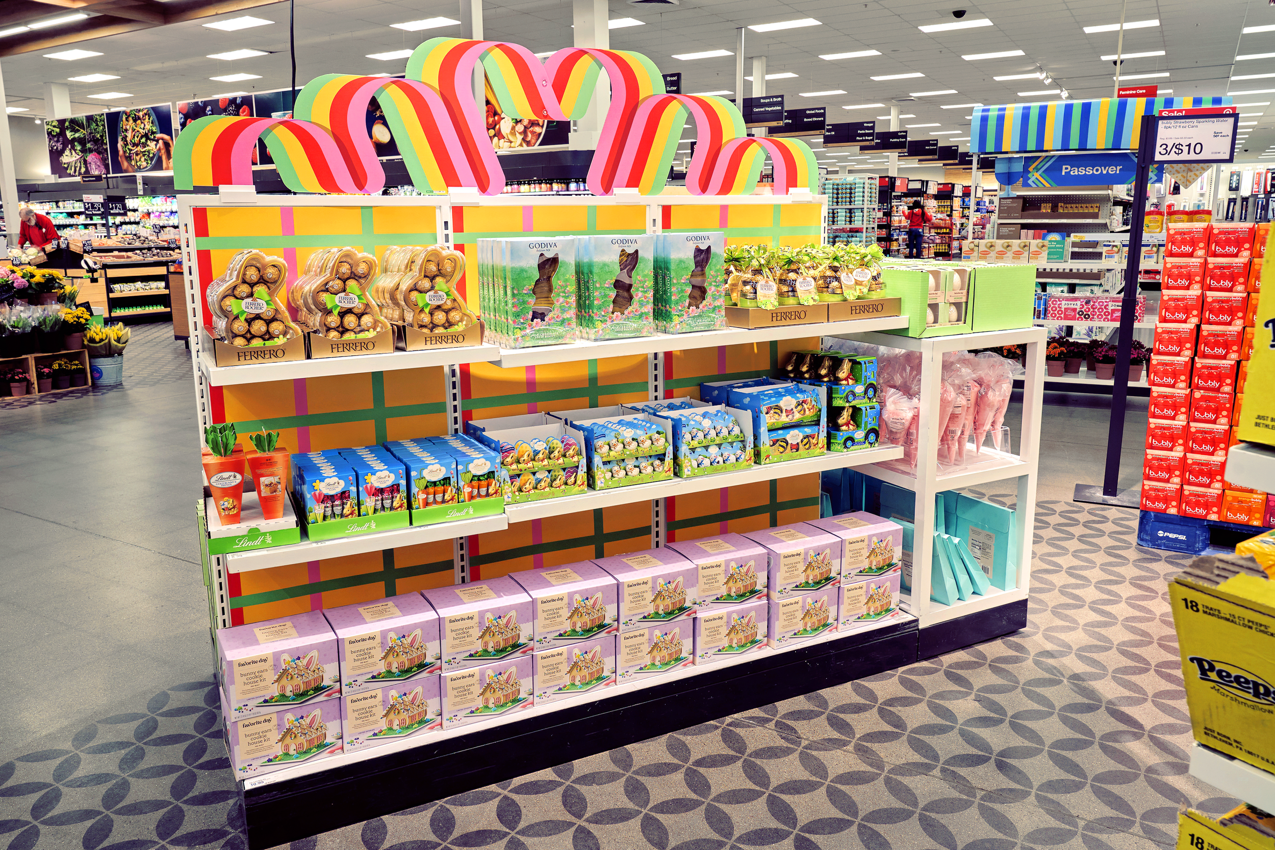
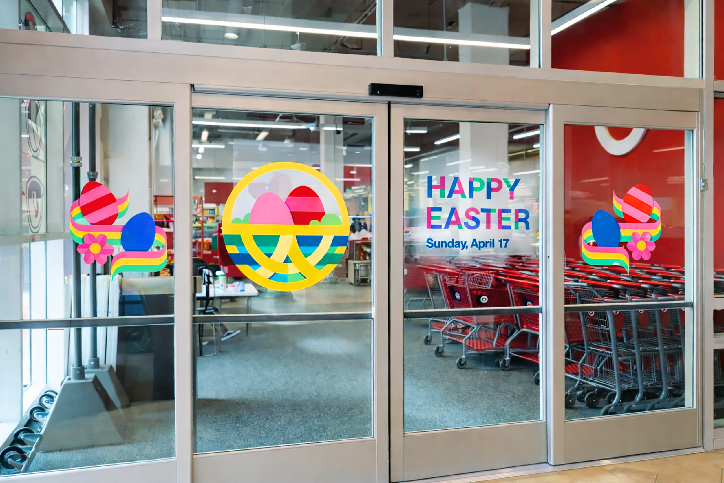
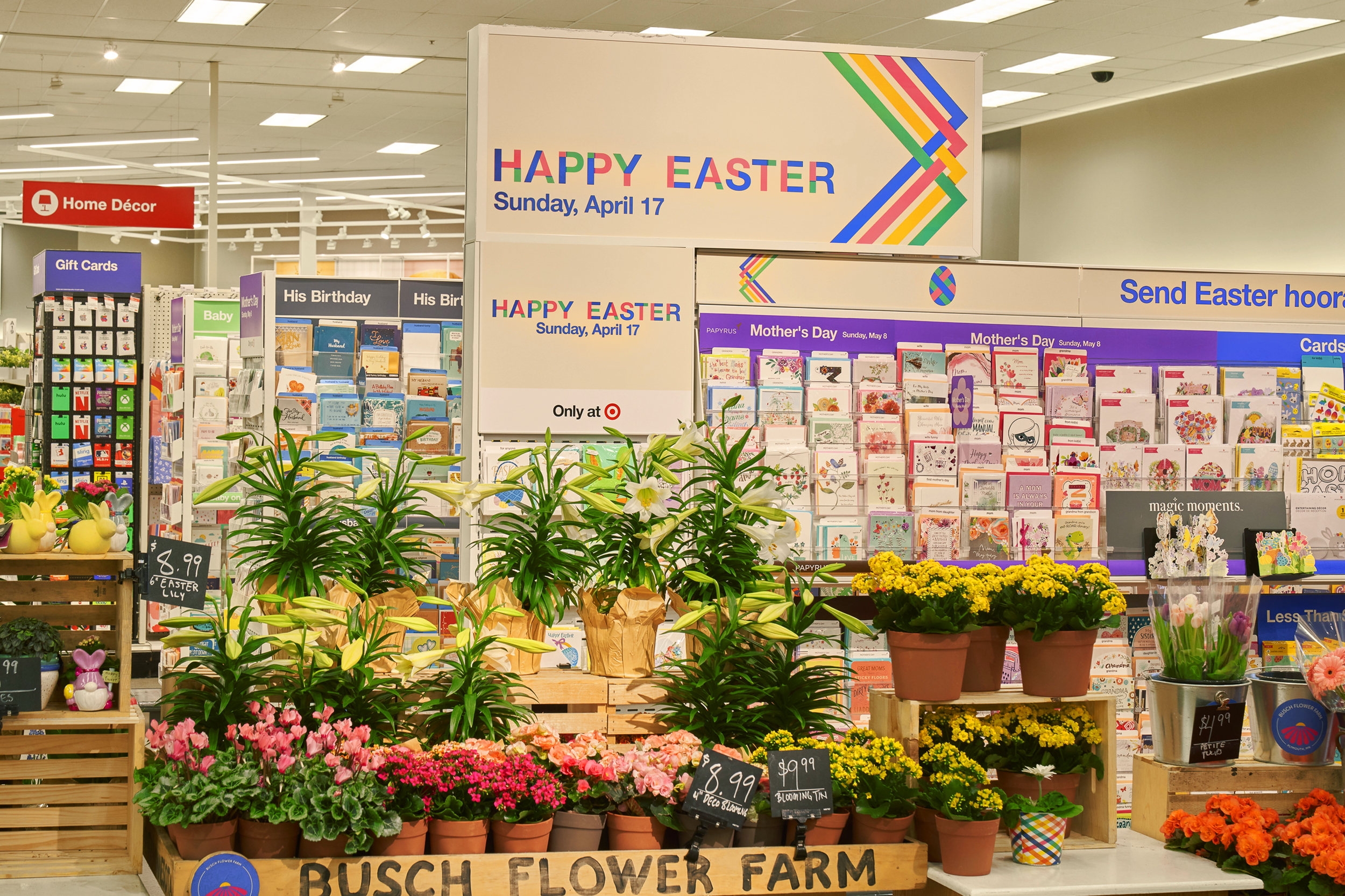
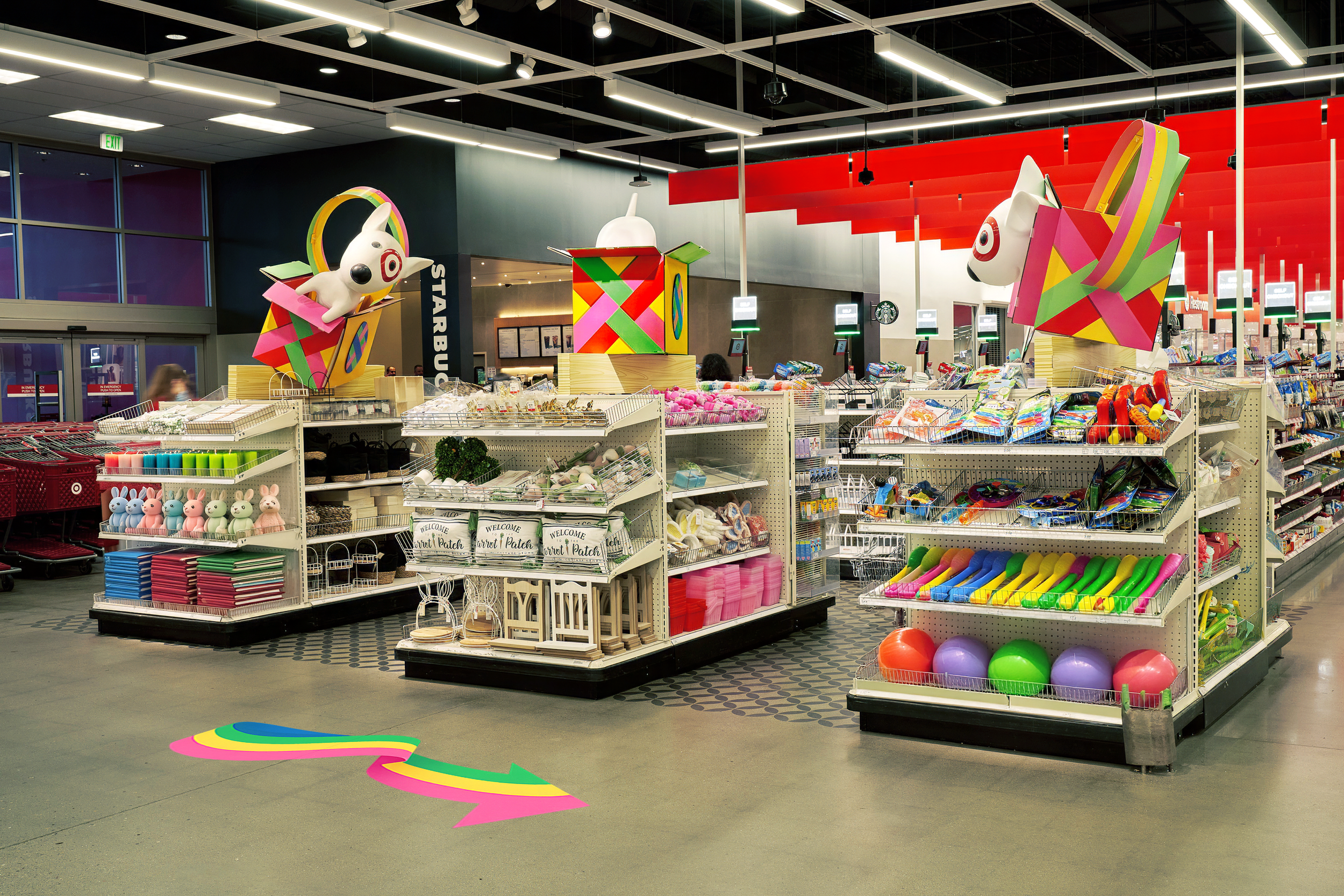
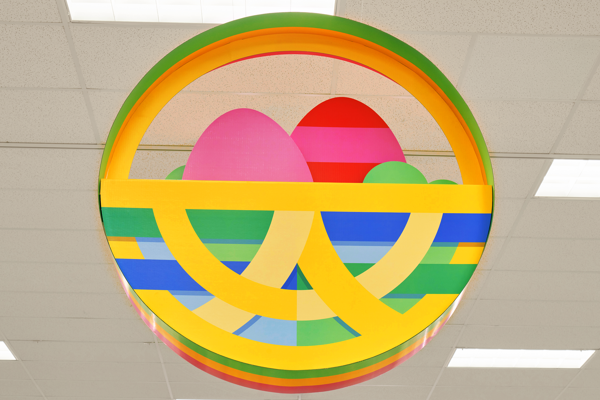
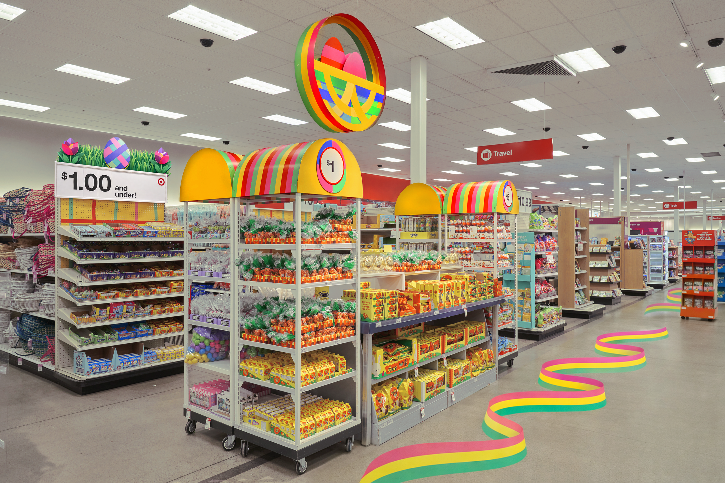
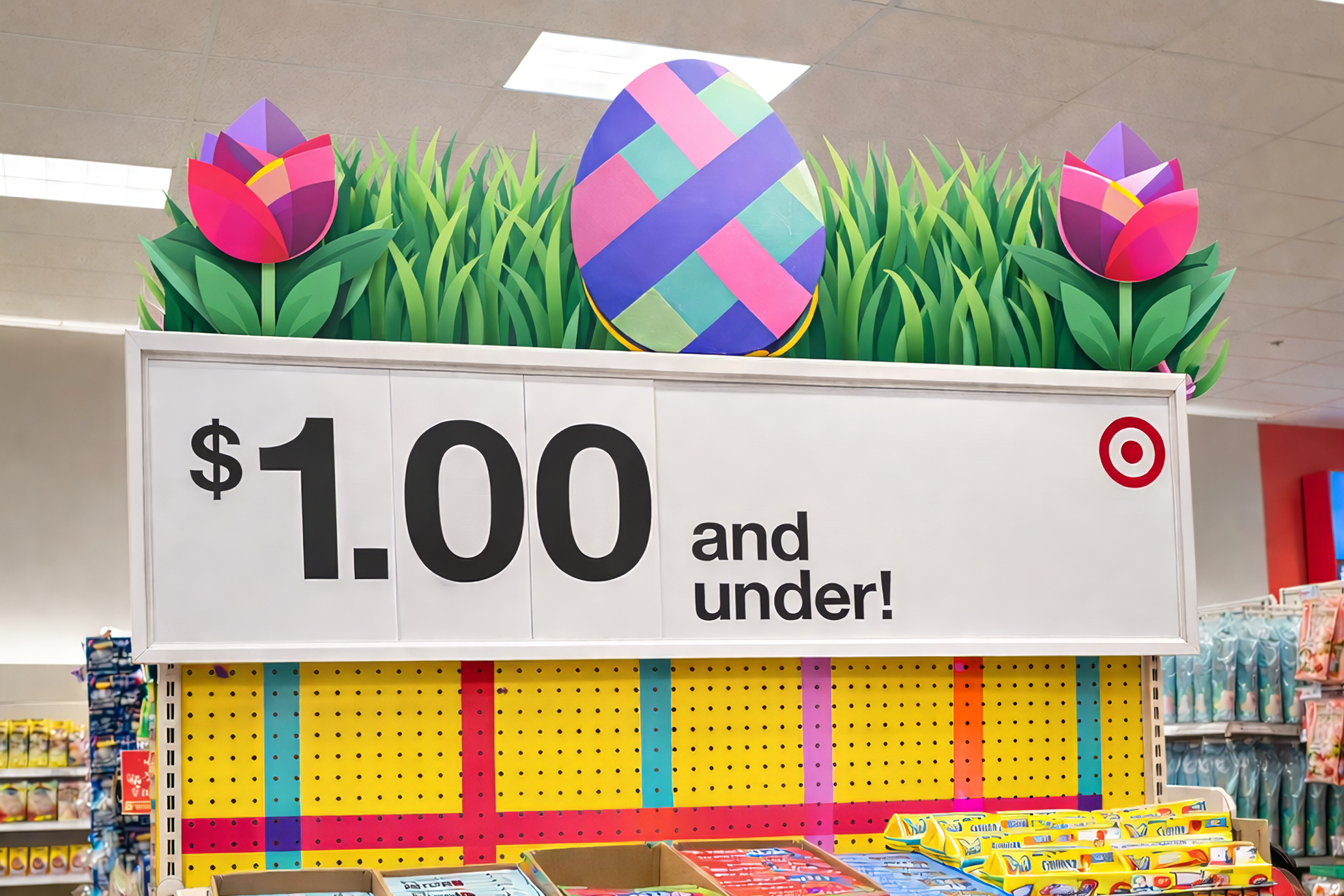
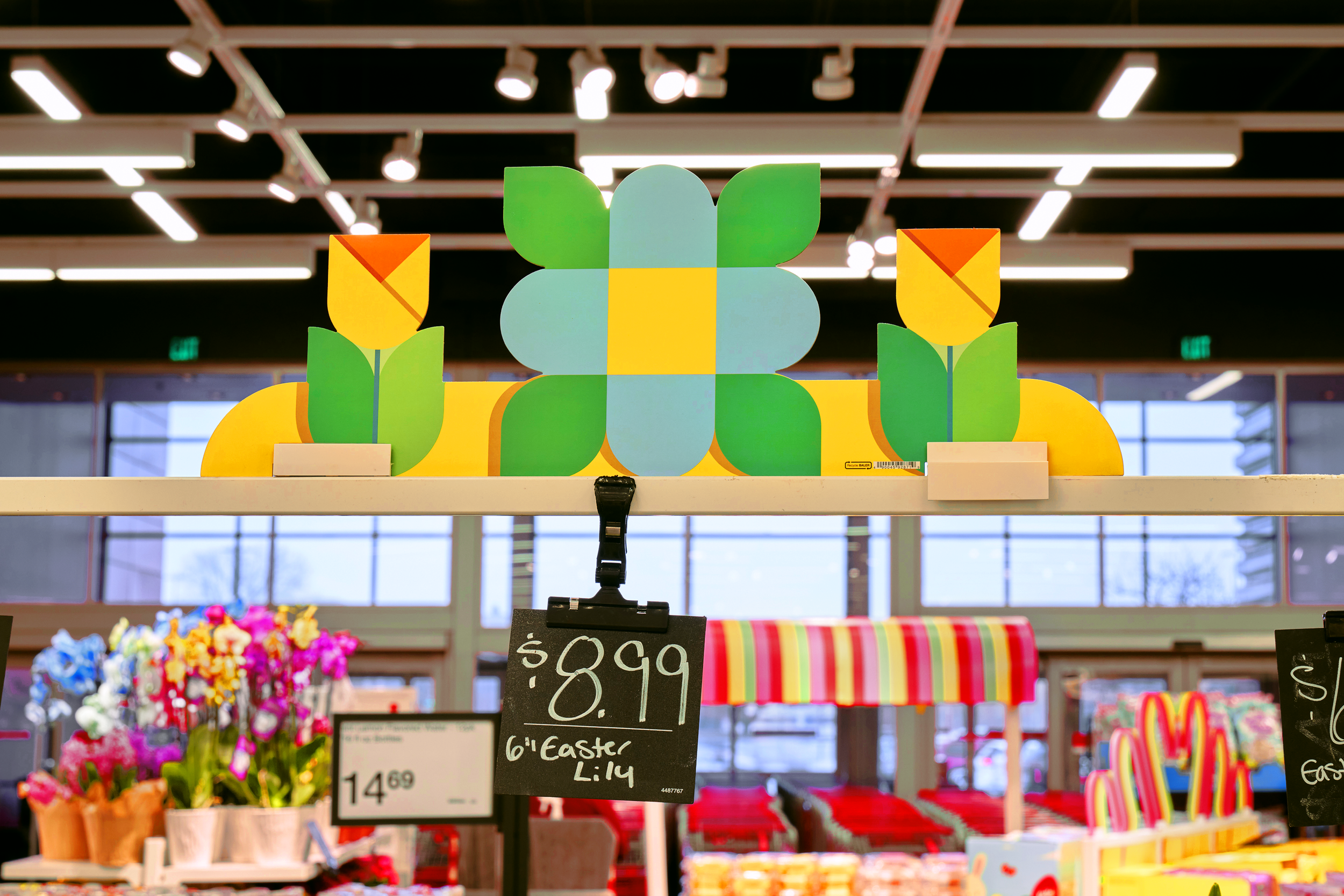
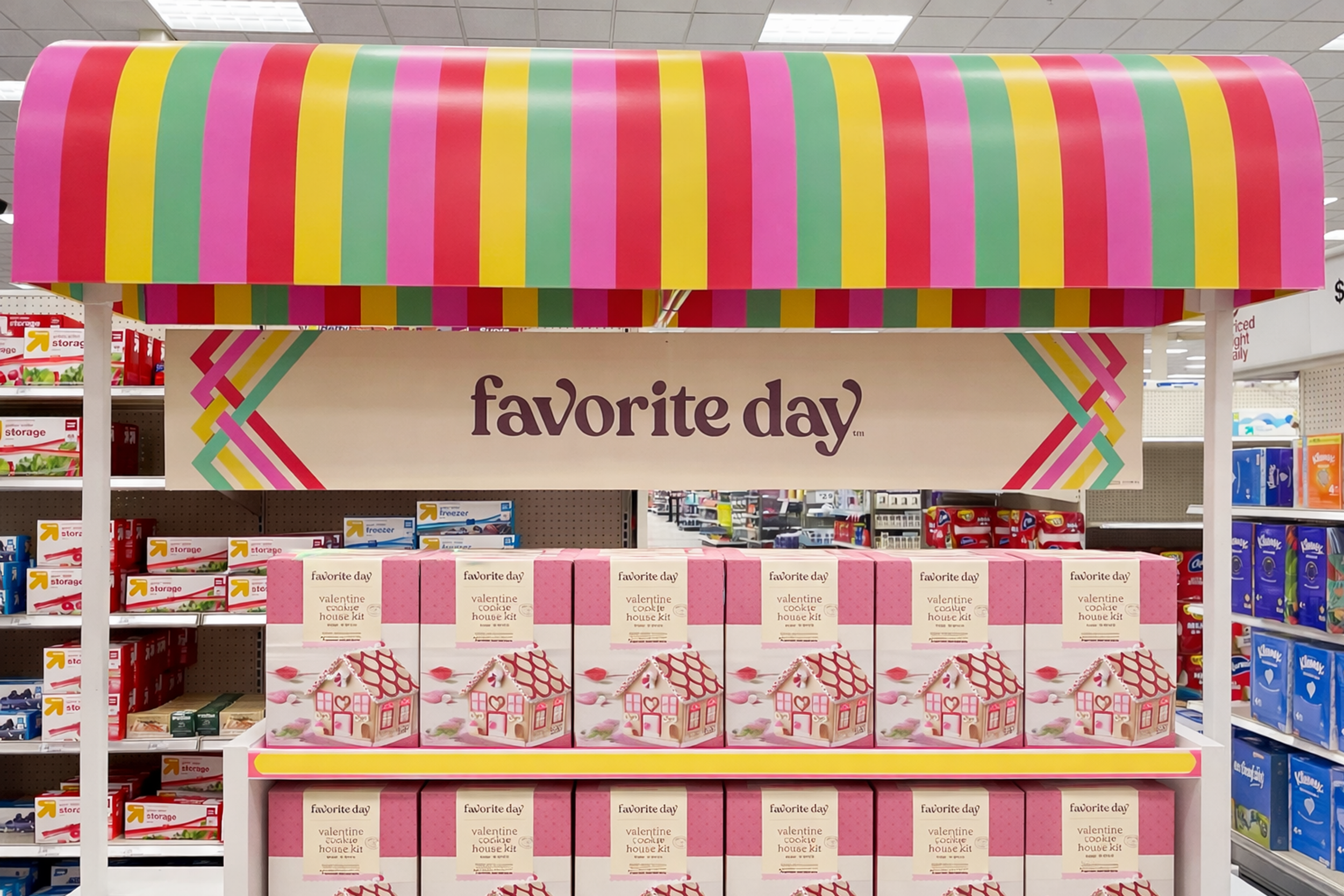
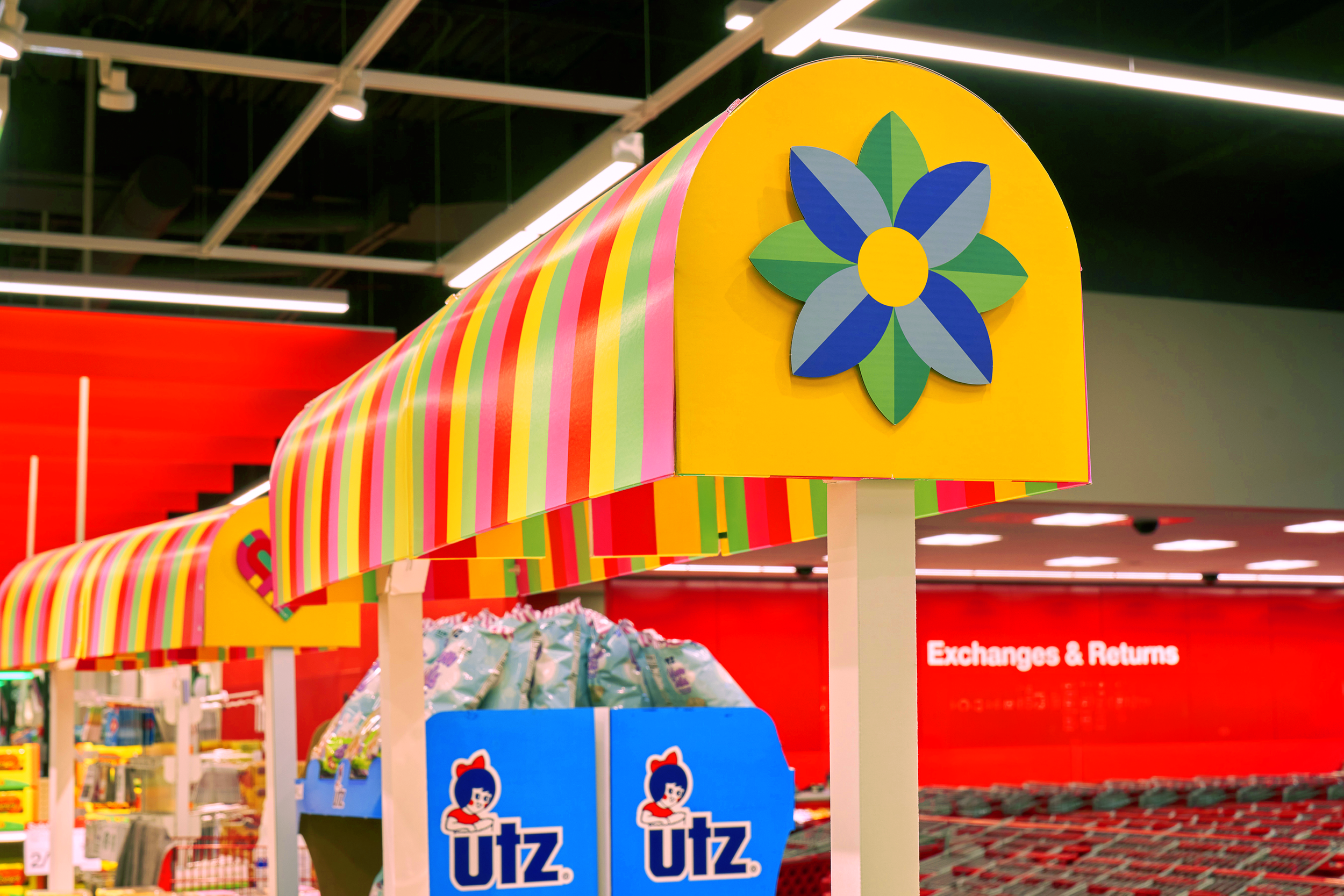
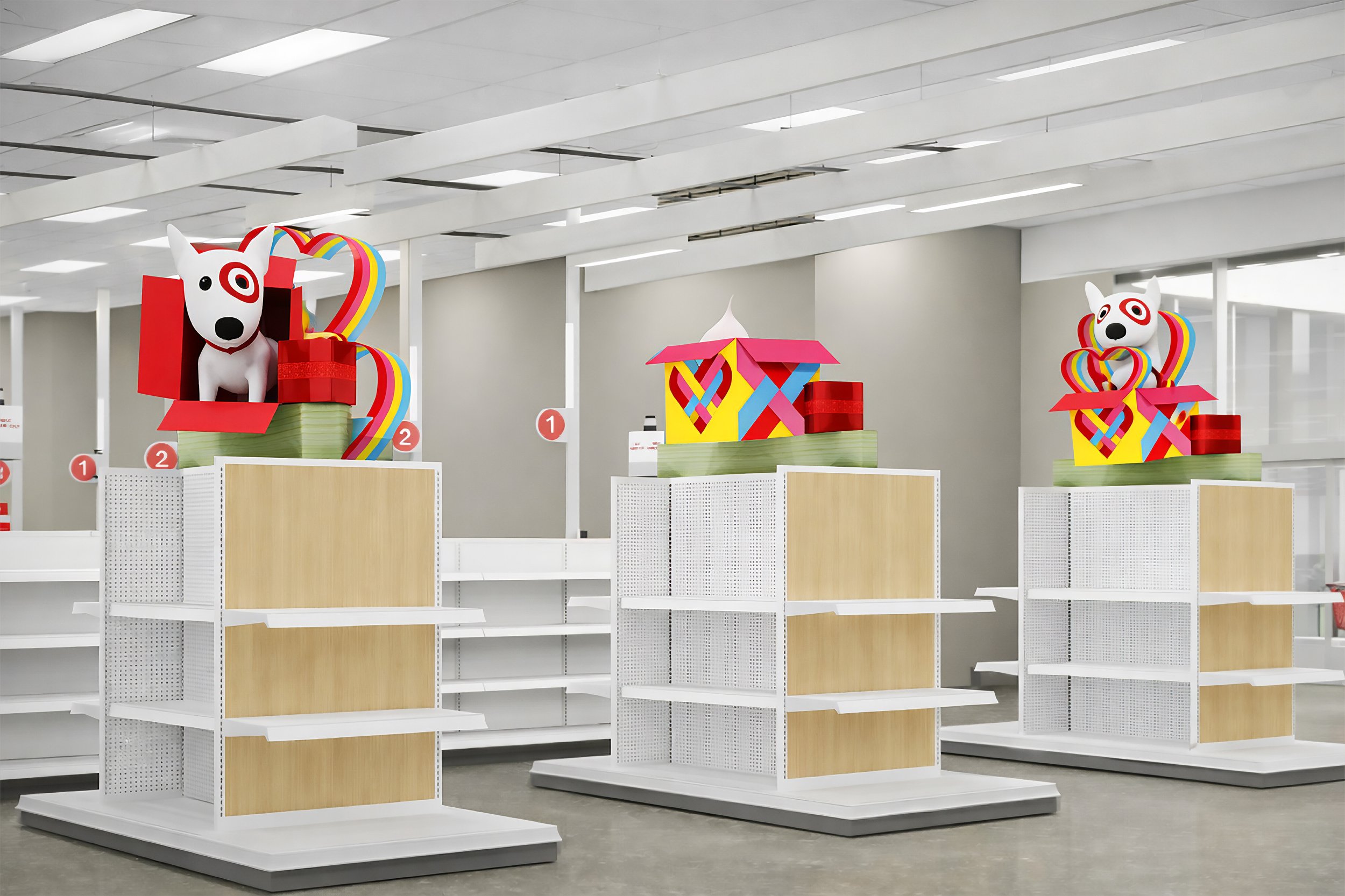
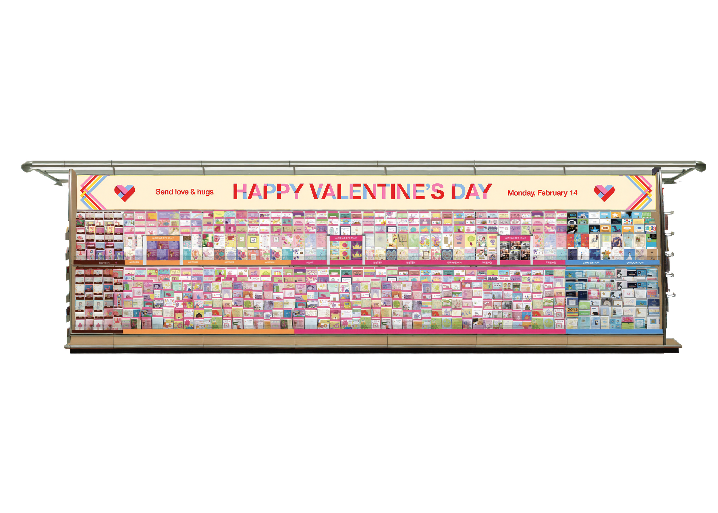
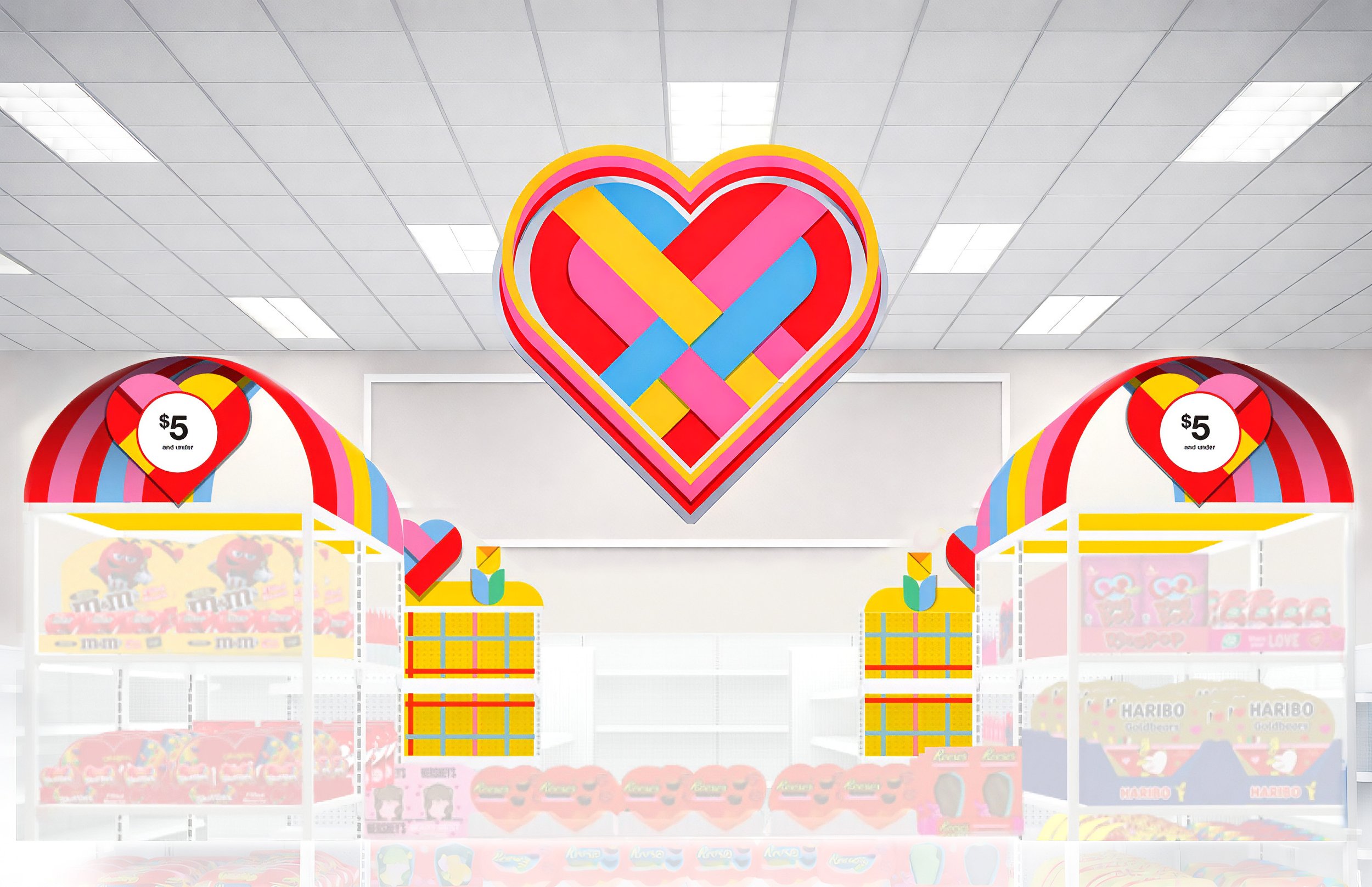
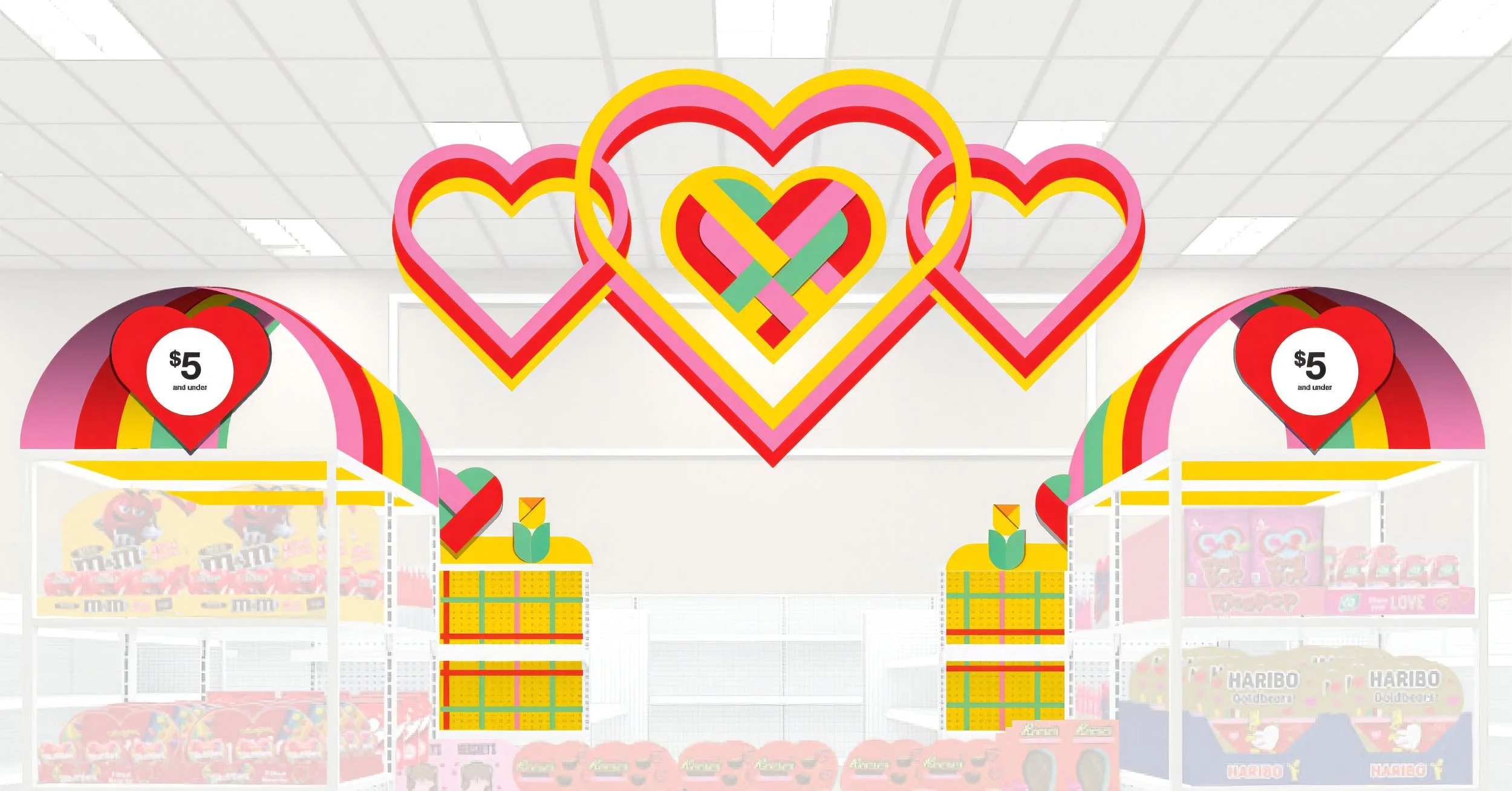
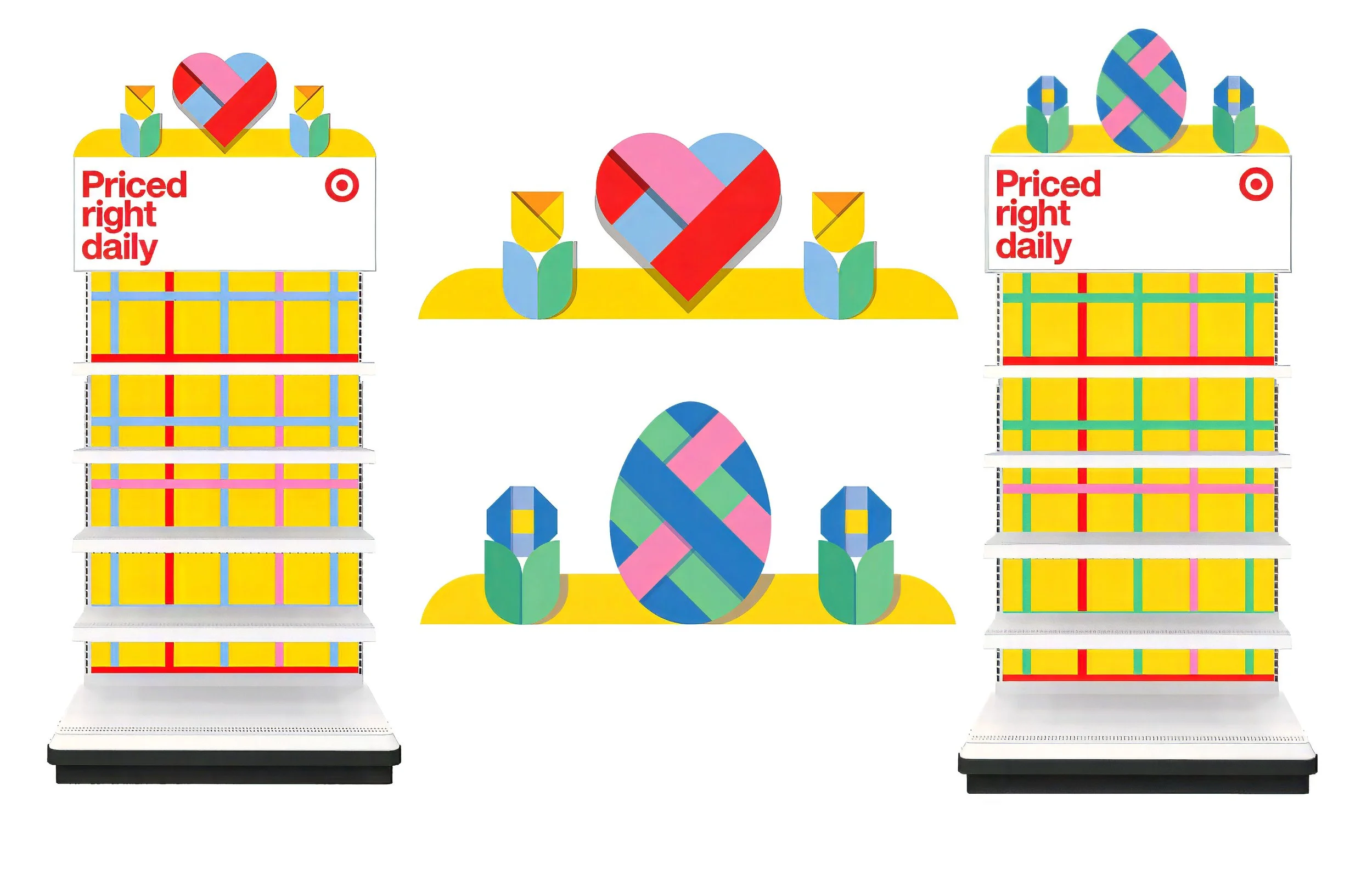
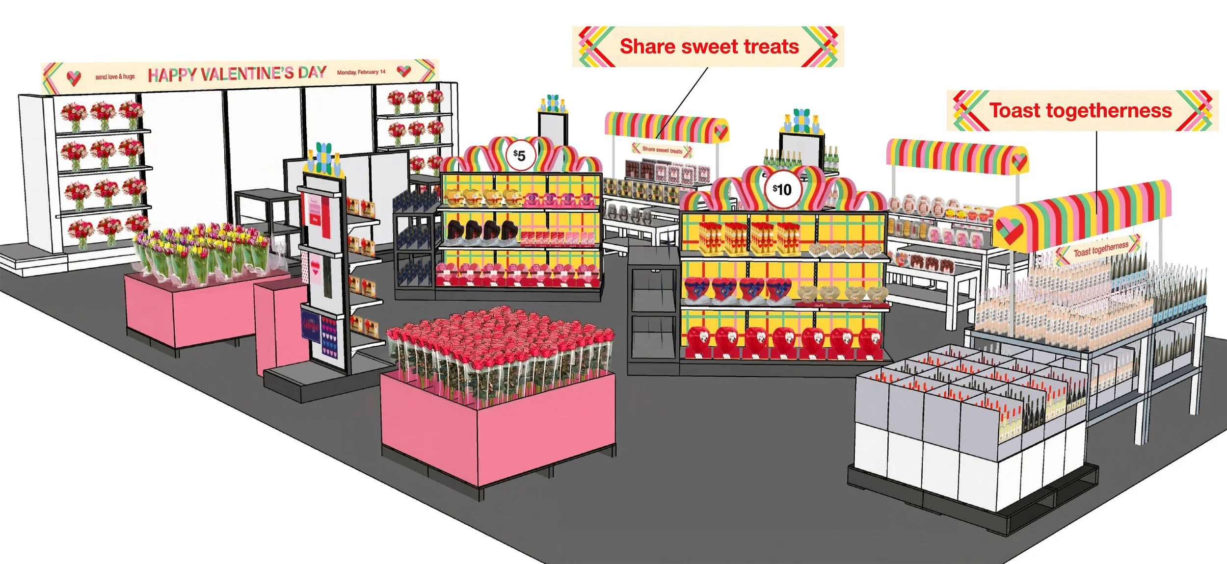
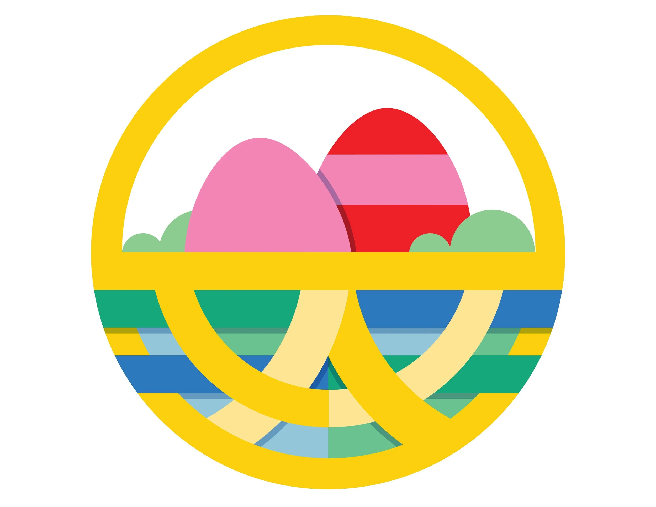
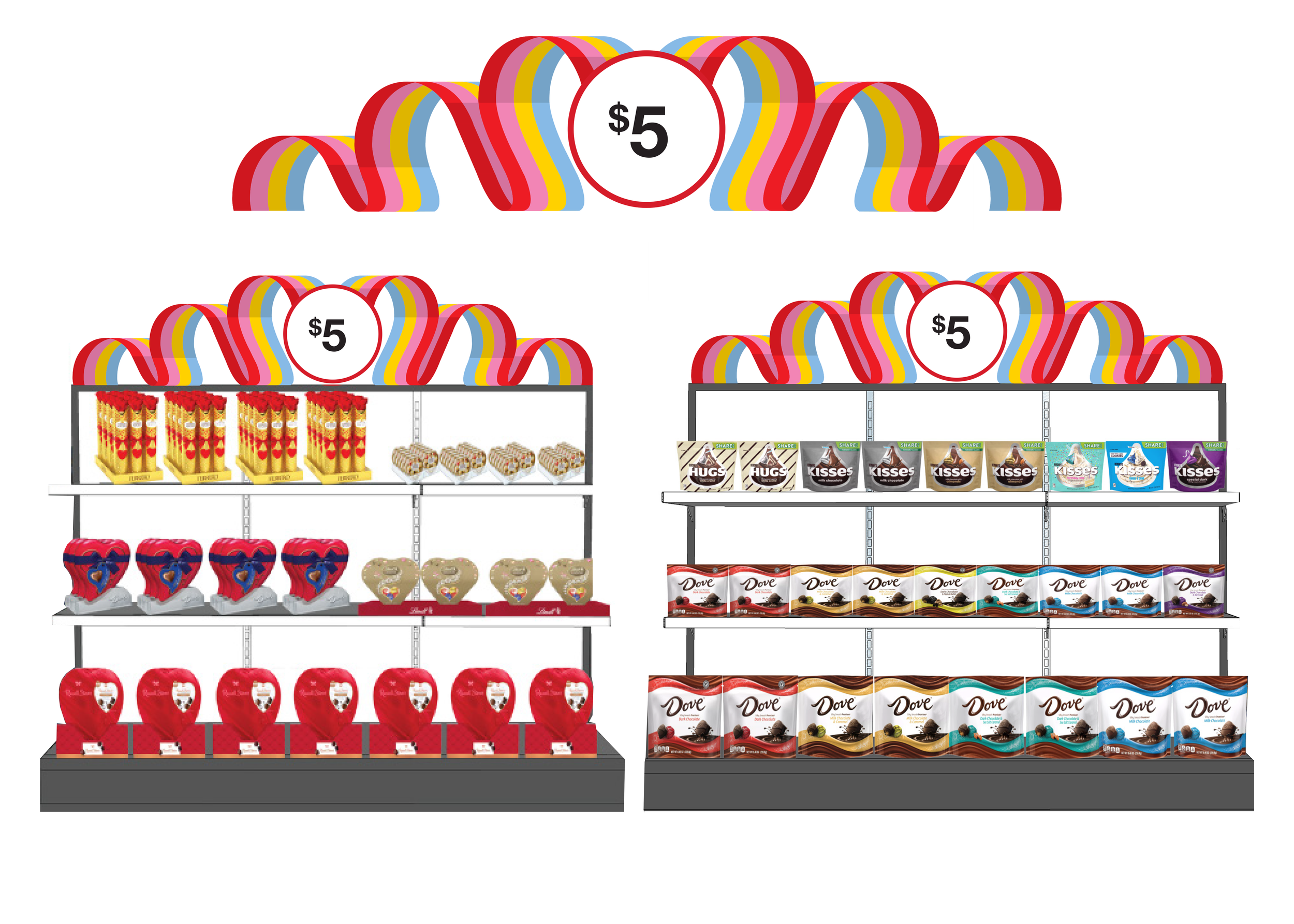
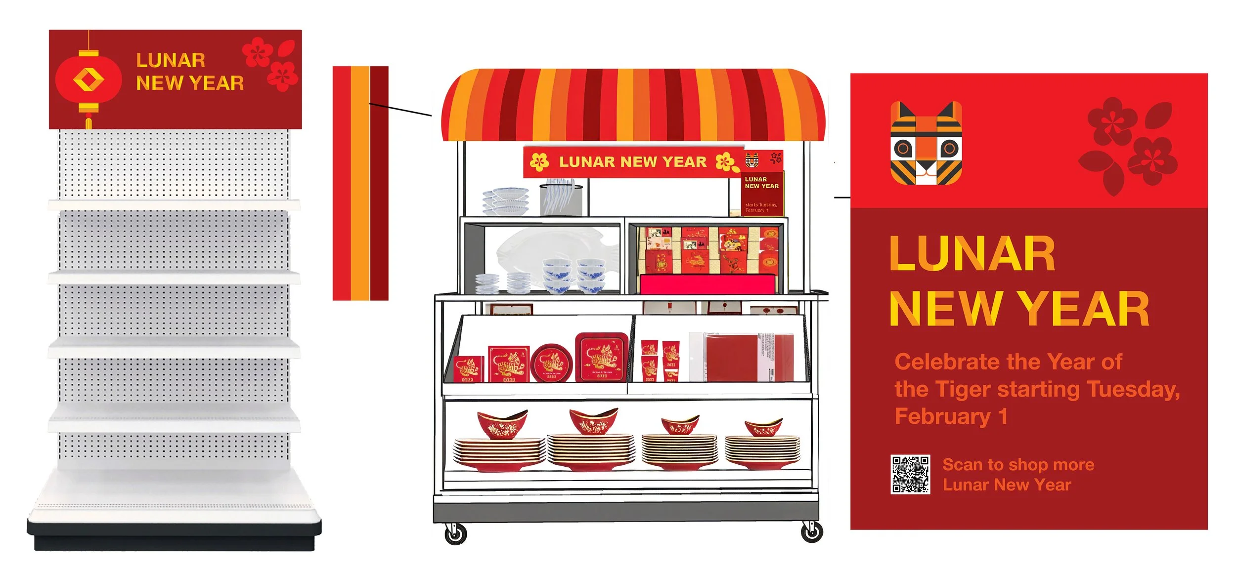
Threaded together by overlapping lines and flowing forms, Target’s Spring in-store experience was designed to feel like a continuous journey of discovery. Graphic ribbons wove through a blooming garden backdrop, evolving as the season unfolded and seamlessly shifting from Chinese New Year—celebrated in 2022 as the Year of the Tiger—through Valentine’s Day, Easter, and Mother’s Day, all while maintaining a sense of connection, rhythm, and growing joy. We partnered with Katie Kirk from Eight Hour Day Studio to illustrate this concept.

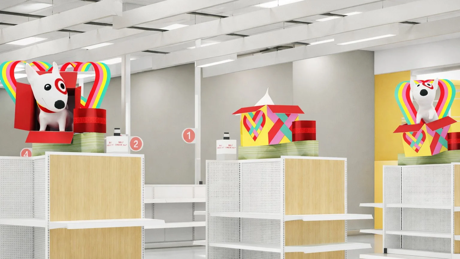
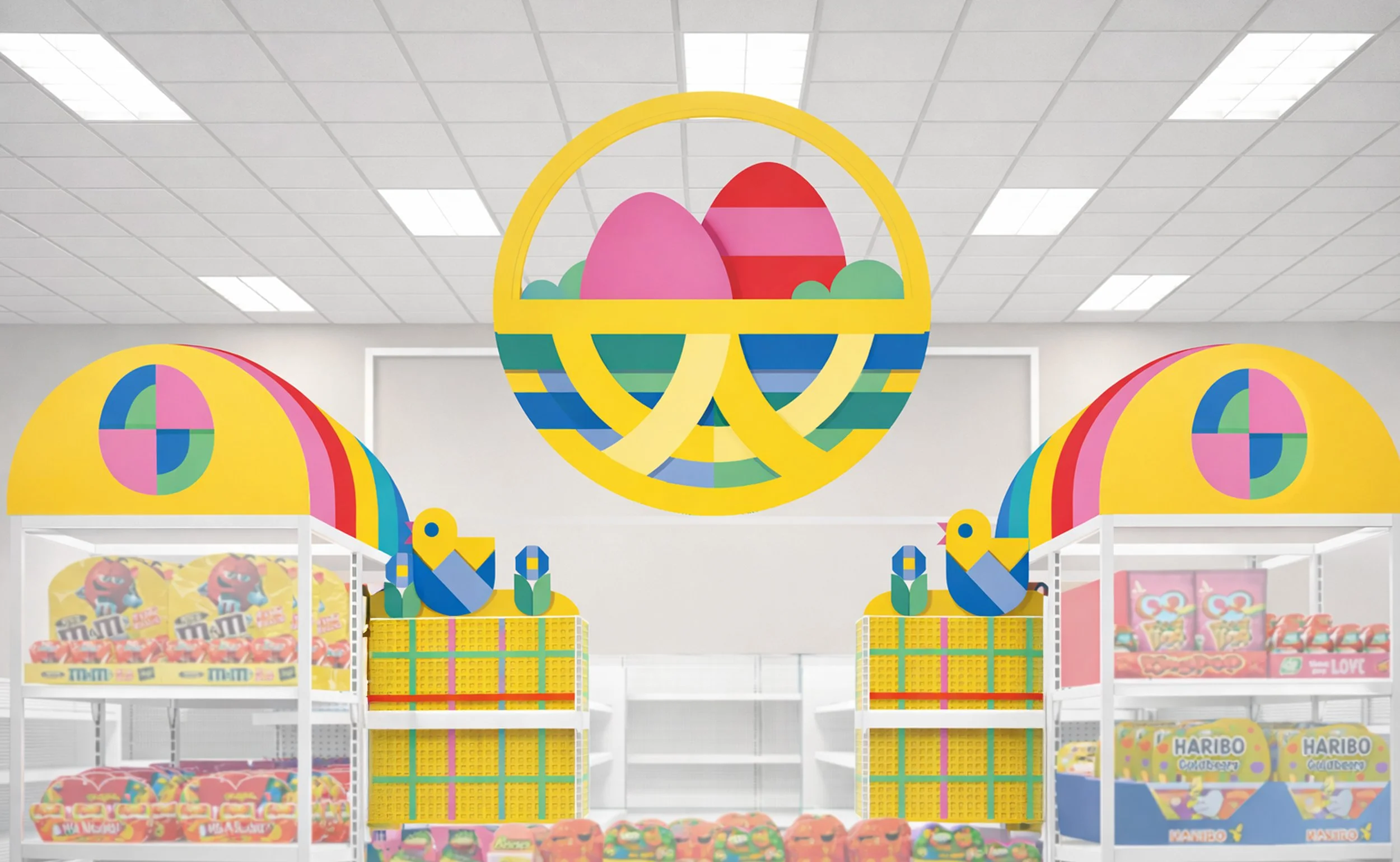
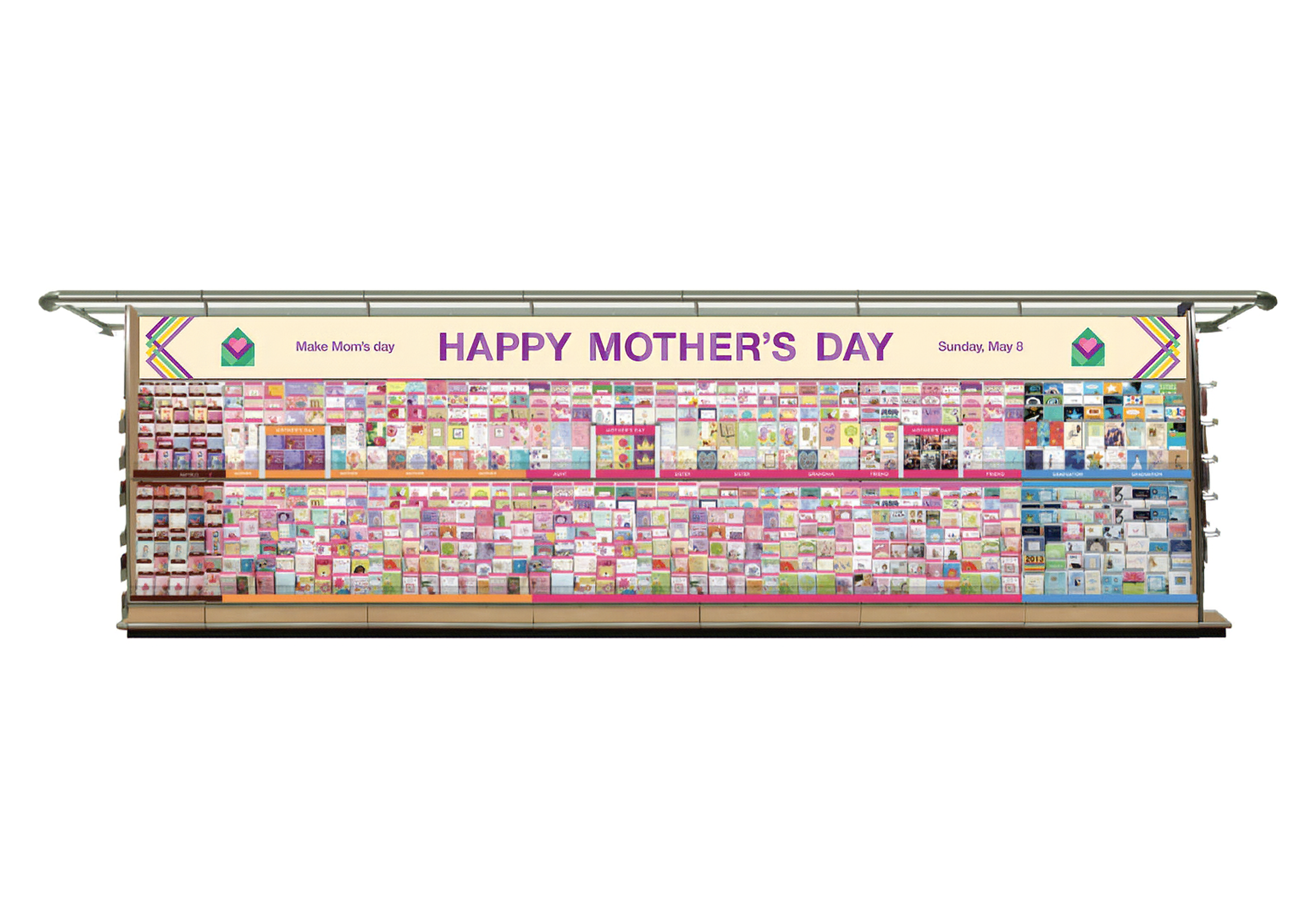
Seeing it come to life
A compilation of in-store images of the Spring store experience at Target.